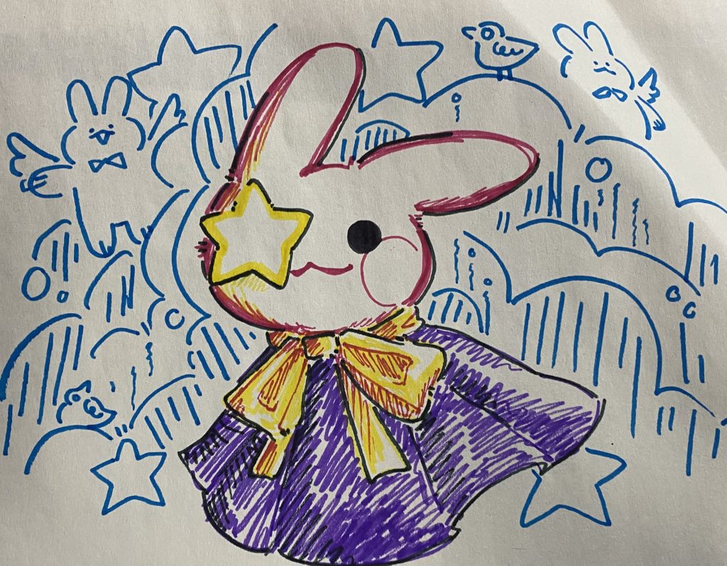
I don’t really think my mask gives off much in terms of my identity, at least visually. It was pretty difficult to decide what I wanted to do with it, but I eventually settled on this design (you can tell that I changed my mind in the middle of one attempt because of the uneven parts of the mask, where I tried using clay to alter the face shape a bit).
The colors used on the mask were mostly because I liked these colors. Green is my favorite color, and I also like blue and white. The red and pink flowers (red is a bit hard to see here) looked nice, so I got them for this project. There are also patterns painted on, as well as wires to string the flowers onto the mask, which represents my arts and crafts hobby.
The mask design itself is based on dàn (旦), which refers to the female roles in Beijing opera. There is no specific version that I based my mask off of, but I did have some inspiration from “The Drunken Concubine,” a famous opera about one of the Four Beauties of ancient China, Yang Yuhuan, for the overall design. I didn’t originally plan on using a Beijing opera style of “makeup” for this mask, but was reminded of it when I was researching for the artist research paper. I also really like the overall style of Beijing opera, and it reminds me of my grandfather, who passed away in 2013. My first exposure to Beijing opera was when he took me to the theater near our house in China when I was little.
I planned to use fake flowers to decorate my mask for a while, but other than me liking flowers, there is a bit of a cultural reason to them as well. There is an old tradition in my family (and I believe in the region where my family is from) where flowers would be given to a child when they turn 16: boys receive white or light-colored flowers, while girls received red, pink, or purple flowers. I included white, pink, and blue flowers for a specific reason based on this tradition, as well as myself. The red and pink flowers represent my identity as the daughter of my family, while the white ones represent my (somewhat) discomfort with that idea, since I do not fully see myself as a daughter. The blue flowers were not included in the tradition, but I chose to see them as an “in between” of being a son and a daughter, even if it’s just a one-time gift of flowers that I received years ago. I did ask around to see if any of my Chinese friends knew about this tradition, but it seems to be regional, and the flower colors differ from family to family, so it’s kind of silly. Here, it’s just a bit of my personal reaction to this tradition when I experienced it at 16. The flowers are also arranged in a way that resembles a kind of headdress an opera character would wear.
There was an idea to include designs similar to what you would see on fine china, but that was too complicated. I kind of had that idea with the patterns, but it’s not the same.
Having seen Rent and La Boheme, as well as reading “Scenes from the Latin Quarter,” I feel like the time periods in which these were written had a lot of influence on the story. Although Rent and La Boheme have the same source material, they all have minor differences in the way that the story is delivered to the audience. It’s kind of hard to describe, but I also think that the way the story is delivered influenced how I interpreted each portrayal.
I think that the opera version of La Boheme is probably the most difficult to really “relate to,” mostly because it’s an opera and everyone else in the audience dressed in very fancy clothes. The audience isn’t really students, in my opinion, but it can still be enjoyed by different demographics. It just changes how the story is experienced by the audience, which is why I feel like this version is very different from the other two. I felt like “Scenes from the Latin Quarter” was more palatable, so to speak. It might be because the original book was in written form and the subtitles didn’t even work for me until Act IV at the opera, but it just felt different to me. The atmosphere at the Met Opera house really changed how I experienced the story, and it really felt more dramatic and exaggerated than Rent and “Scenes from the Latin Quarter.”
I noticed that the story of La Boheme is more dramatic and focused on Rodolfo and Mimi, rather than being a collection of short stories like “Scenes from the Latin Quarter” was. The story itself is nice, but I didn’t really like the back and forth between characters across different scenes, and the fact that all of it was sung made it get old really fast. I did enjoy watching La Boheme, but I felt like there was the same issue with the Arpino where I was more interested in the music than most of the performance. I can enjoy the singing and pit orchestra on their own, but the story kind of fell flat in this style for me. The part at the end where Rodolfo spoke rather than sang his line in response to the doctor really felt emotional though, and I thought that part was really good.
In terms of storytelling, I liked Rent more than La Boheme. It was dramatic but in a very “New York” way, which I thought was fitting for the setting of the movie. I was initially a bit skeptical about converting “Scenes from the Latin Quarter” into a more modern setting like New York, especially after seeing La Boheme. I am also not a movie person, so I thought I wouldn’t enjoy it that much. However, I really liked Rent. The original characters in “Scenes from the Latin Quarter” were made into different ones for the movie, but I still feel like I could see aspects of the source material in how the characters were portrayed in the movie. While La Boheme focused on romance, I think that Rent really captured the struggle of everyday life for artists and writers, and the transformation of this into a modern setting was also really good. Not only did it tell the story, but it also expanded on the issues discussed in “Scenes of the Latin Quarter” by adding commentary about the HIV/AIDS epidemic as well as queer relationships and how these people live their lives.
I personally enjoyed Rent more than La Boheme, but I feel like it was nicer to have experienced both and base my interpretations and opinions off of that, rather than only see one version and simply disliking it. I think watching Rent did make up for La Boheme feeling “boring” because it was more modern and translated well to me, which helped me digest the story better and be able to appreciate La Boheme more as well. If I only watched La Boheme, I would have just focused more on the music and forgotten the plot altogether.
I like how Rich went into detail about different figures in the history of tattooing in the United States and how they were influenced by different stigmas surrounding the practice in the past. I found it interesting that people would tattoo on others, and those people would then show off their new tattoos as a form of advertisement. This was basically happening for years when people believed that tattoos were associated with prostitution and gang activity, which I think would have added to the whole “underground” vibe that Rich mentioned was really important to him. Rich really made it seem like tattooing was for the love of the craft rather than for money, which I think really connects to the material that we cover in this class.
I don’t really like the idea of getting tattoos on myself, but it was really interesting to hear about its history from Rich’s perspective. I already had some prior knowledge about the history of tattooing, but it wasn’t anything as specific as what Rich discussed.
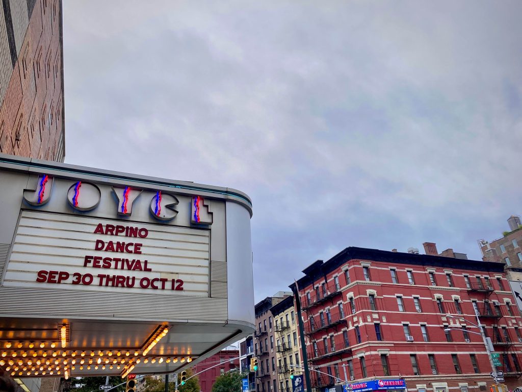
We went to see the Arpino Dance Festival as a class on Sunday. The day itself was okay, but I had a pretty bad start to the day. I had to walk 30 minutes to get to the train, only for the MTA workers to kick us off the train just one stop away from the ferry, which I then had to pay to even leave the train station! It was pretty annoying, but I managed to make it on the ferry before it departed. However, that wasn’t even all, because there was a creepy person that was visibly sick, and he coughed super loudly while facing me and staring at me the entire time…
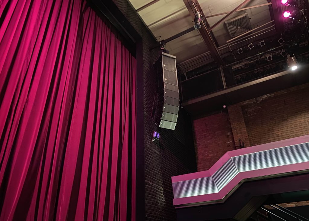
I honestly kind of expected for the theater to be much bigger and flashier, kind of like the other theaters on Broadway, but it was still pretty charming. I liked the style of the sign and their arrangement of the LED lights. We had front row seats, but I feel like somewhere in the middle would have been better for the performance because the stage lights were shining directly in my eyes, which was really uncomfortable.
The performance itself was very good, but I am more of a music person, so I mostly paid attention to how the performers lined up with the music rather than how they danced. Their actions (like with the tambourines in Confetti) aligned with beats in the music, and it was pretty satisfying because it was all in time. The dancers were also in sync and very graceful. I noticed that they placed a lot of emphasis on their limbs rather than their torso, which makes sense.
I really liked the style of music they chose for the fourth performance. The color and style choices for the performers’ outfits, as well as the lighting, really gave them that jewel-like appearance which I found extremely beautiful. I also think the “couple” performers had really good stage presence and chemistry, which added to the feel of the performance. I honestly thought the third performance was beautiful as well, and the first one was very lively and interesting too. I just didn’t really like the second performance except for the cellist’s parts, mostly because I was really grossed out by the sweat flying everywhere (no offense to the performers).
After the show, I managed to get lost trying to find the right direction for the 1 train, but I went out to get milk tea after. I originally planned to go to Chinatown to walk around, but I didn’t want to get rained on any further, so I just took an express bus home.
Overall, I thought the performance was really nice. I just wish I was just as into dance as I was with music, because I was mostly focused on the dancers’ steps and movements in relation with the music, not on their own. It might have been better to have more knowledge about ballet and dance in general so I could have a better understanding of the performance.
Shepard Fairey. No Future. 2017Ai Weiwei. Study of Perspective. 2017
No Future is a piece of artwork created by artist activist Shepard Fairey in collaboration with another artist activist, Ai Weiwei, as part of The Skateroom in 2017. This collaboration project involves printing the artist’s work on limited edition skateboards (also available in print version), and each of the artists’ work was created directly in response to the harsh political and social climate of the United States. No Future in particular is a response to the massive waves of racism, sexism, xenophobia, and the violence fueled by this overall bigotry following the 2016 presidential election. Ai Weiwei’s piece, a part in his ongoing project Study of Perspective, is also shown.
I believe it is very much relevant to this day, as fear has been a prevalent part of our lives for the better part of the past decade, whether it be economic, social, or racial issues throughout the entire nation and around the world. It almost seems hopeless, which makes it very fitting that Fairey named his piece No Future. The artist stated that, when creating this piece, he kept in mind the idea of Manifest Destiny and the idea that rich white men were justifying their greed by using the excuse of “God’s will,” and how he felt that it related to the political climate in 2016-2017. It still applies today, and some could argue that it has become significantly worse.
I went to the Art Lab Open House at Snug Harbor for their 11:00 session. I originally planned on taking public transportation, but Snug Harbor was located extremely far from where I lived and I didn’t really want to wake up early just for a 2 hour commute. I noticed that parking was a bit hectic, and there were a lot of people as well, mainly children with their parents. I didn’t really expect for there to be so many people, but I saw that all of the kids were really excited about the demo classes.
The staff in the building were very welcoming, and the hallway was filled with all sorts of artwork. I wasn’t sure if pictures were allowed so I didn’t take any, but I really liked 3 different pieces that were on display. There was a large piece made of strips woven together to form the image of a maple leaf, a painting of a round bird with green paint, and a painting of an old man with dramatic lighting.
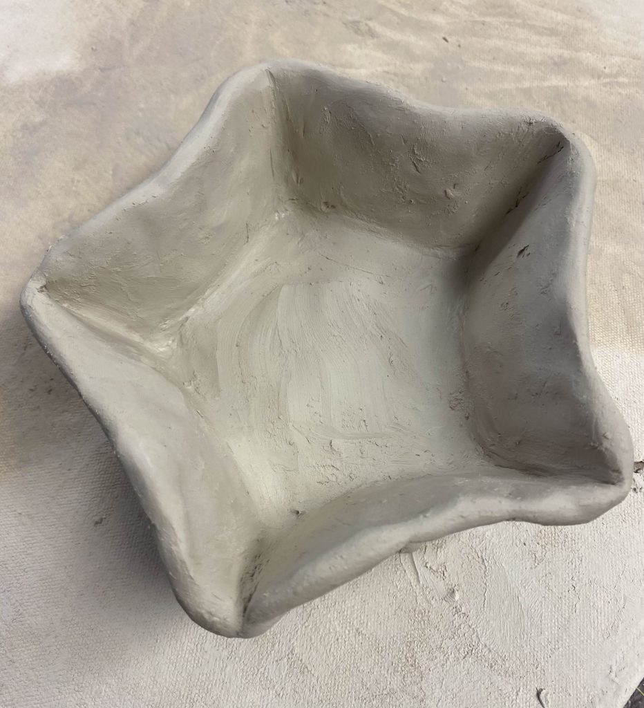
I first went to the ceramics demo, and the teacher for this session was very welcoming and knowledgeable. He taught us how to properly shape the clay so that it wouldn’t collapse or explode in the kiln, and had us make pinch pots and shape them however we liked. I made a star-shaped one, but I wasn’t sure if I wanted to keep it or not, so I left it with the teacher for now and let anyone who wanted it to claim it.
The teacher also showed off some of the pieces made by him and other people that take the ceramics classes. The most impressive one was probably the fully-functioning ocarina that he made entirely from clay.
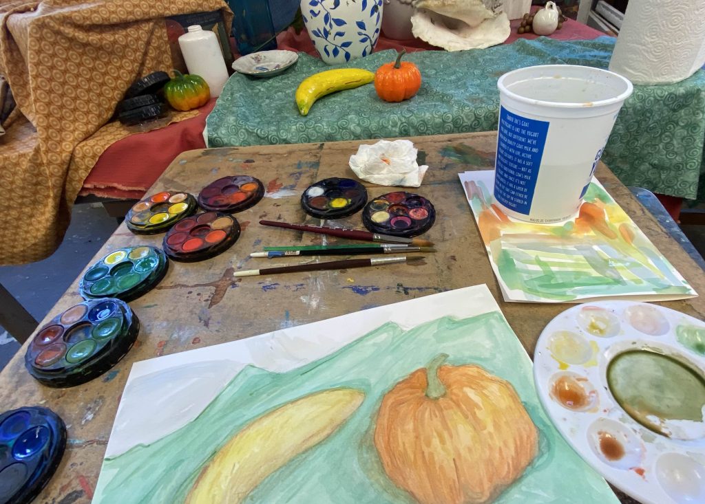
I went to the painting demo next, and the teacher for this session was very welcoming as well. I didn’t have much experience with painting still lifes, so she picked some simple items to arrange for me. We also had a choice between different mediums: watercolor, acrylic, or oil paint. I chose watercolor because I had some experience using it.
I originally wanted to leave when the first session ended to check out the vendors outside the building, but I ended up staying an extra hour to finish up my painting. It was very enjoyable, and the teacher strongly suggested that I look into taking art classes at Art Lab or at college, which I am considering.
The vendors all had a lot of beautiful artwork to sell. I was surprised at the amount of vendors set up, as the entire road outside of the building was lined up with various stands. One vendor (Georgie Galli I believe) had such beautiful ceramics for sale. All of their products were so colorful and detailed, and they also had different kinds of ceramics ranging from plates and mugs to even candleholders or simple decorations. I really considered buying maybe a mug as a gift for my mom, but I planned on going to the city after, so I didn’t want to risk shattering it on the way there.
Overall, this was a very fun experience. All of the staff and teachers at Art Lab, as well as the vendors, were very kind and welcoming. I originally wasn’t sure about coming to this event since it was pretty far away, but I ended up really enjoying it.
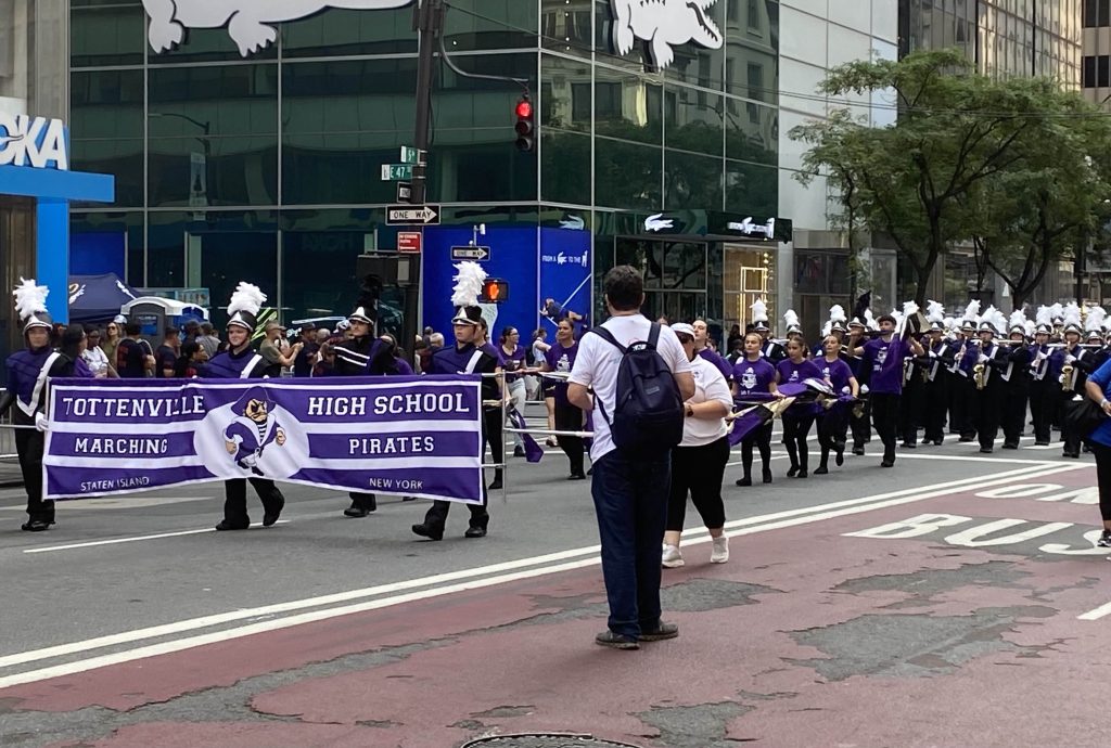
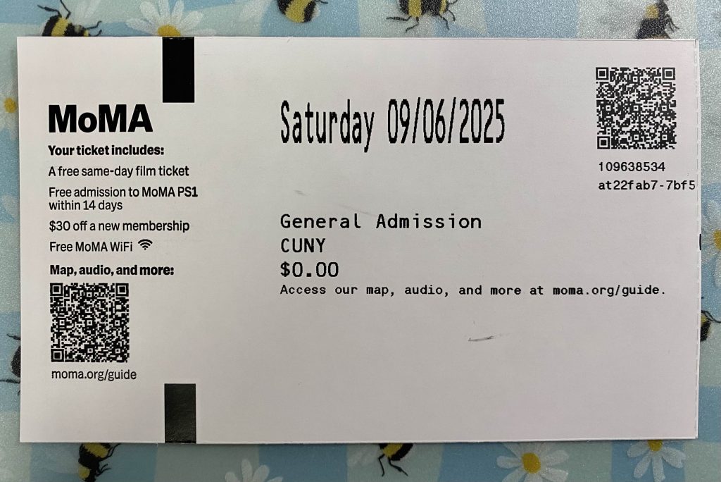
For my independent museum visit, I visited the Museum of Modern Art. I happened to arrive early enough to watch the Labor Day Parade as well, which passed by the front of the museum, and saw my high school’s marching band perform in the parade. The parade itself was fine, but there were a lot of obnoxious whistles and airhorns this year, which ruined the experience.
The museum staff were very professional, and it was easy to get the ticket. I didn’t interact with them much, but I saw that they helped a lot of the other guests when they had any questions.
The museum has 6 floors, 5 of which have galleries. The 6th floor is a café. I only looked at the galleries on floors 1, 2, 4, and 5. There were some galleries on the 3rd floor, but the stairs I took did not have any gallery access for this floor, so I ended up looking at the other galleries instead. The time periods represented by each collection increase from floor 5 to 1, with floor 5 covering the 1880s-1940s and floor 2 covering 1980s to the present. I started from the 5th floor.
The 5th floor has a wide variety of artwork, including galleries dedicated to photography, surrealist artwork, and sculptures. Portions of the floor are dedicated to art produced as commentary on war and race.
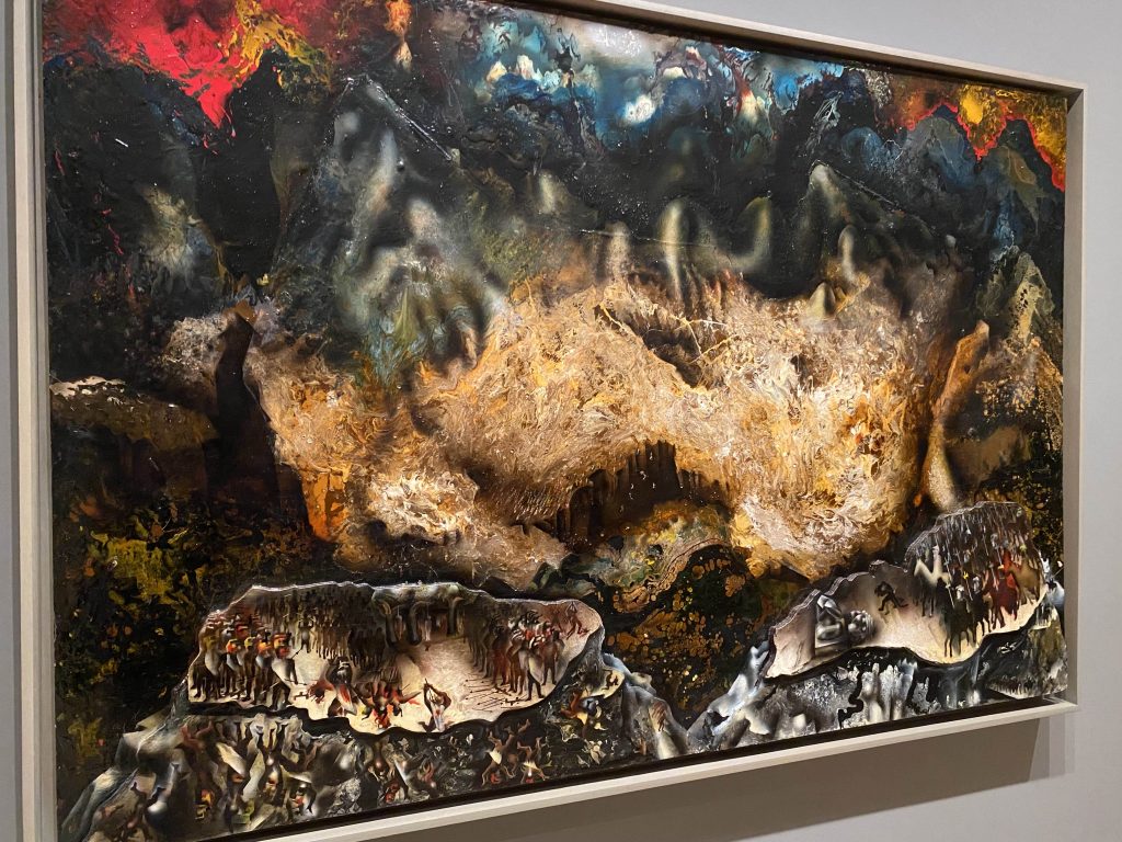
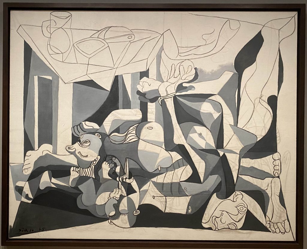
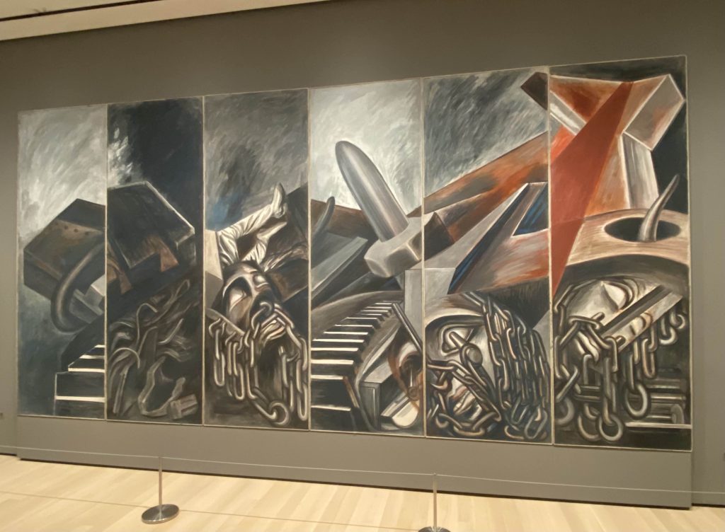
David Alfaro Siqueiros. Collective Suicide. 1936Pablo Picasso. The Charnel House. 1944-45José Clemente Orozco. Dive Bomber and Tank. 1940
These 3 artworks immediately caught my attention in the first section. They all depicted the hopelessness of life during war. The shapes on each piece are almost indistinguishable, all overlapping or melting into each other like they’re being tangled together. The style varies but they are all very dramatic and eye-catching. This part of the gallery did make me feel a little disturbed because of the themes of war and destruction, as well as the dramatic, dark colors used by each artist. I also noticed that some used different mediums and textures, like the piece by Siqueiros shown above, which was done primarily on wood and had elevated portions of the artwork.
The gallery on the 5th floor that I really liked was the photography. All of the photos were of various people and you could tell that they are all unique, but they all seem like ordinary people with how they pose with one another and do mundane things.
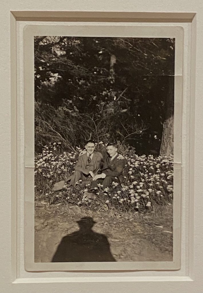
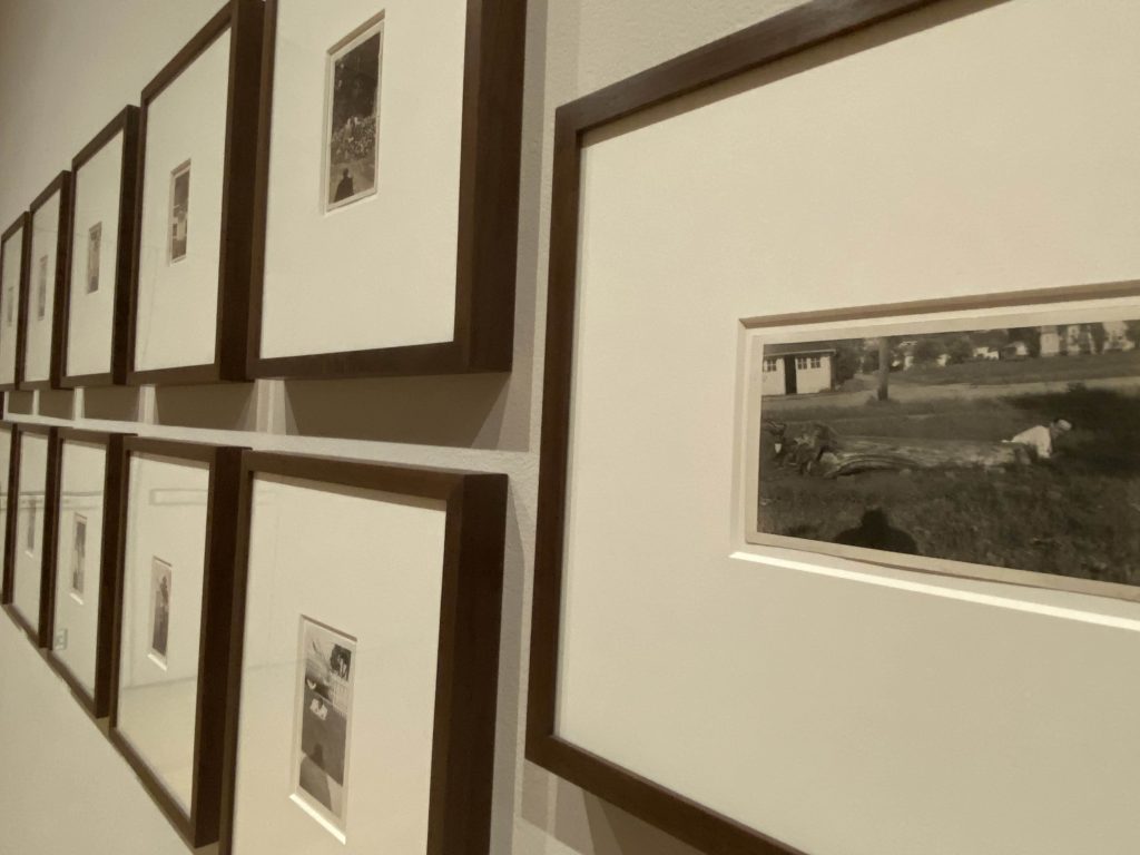
A particular set of photos really caught my attention, shown below.
These photos are by an unknown photographer, mostly taken between 1935 and 1951, with two being from 1900 and 1916 respectively. When observing each photograph, it’s clear that the subjects are often the same people even though many years have passed.
What really stood out to me about this set of photos is the fact that the shadow of the photographer is always visible at the bottom. They mainly stood to the side and faced the camera towards the people in the photos, and sometimes they’d wear a hat, but might not have joined them in the photos. While the subjects are posing or having fun, the photographer is always watching and capturing the moment with a camera, and the presence of their shadow makes the photos feel more ordinary in a way. A majority of the photos in this gallery were very ordinary.
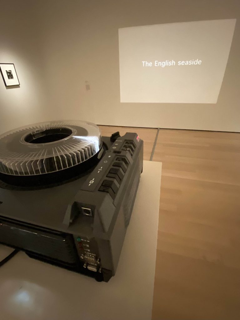
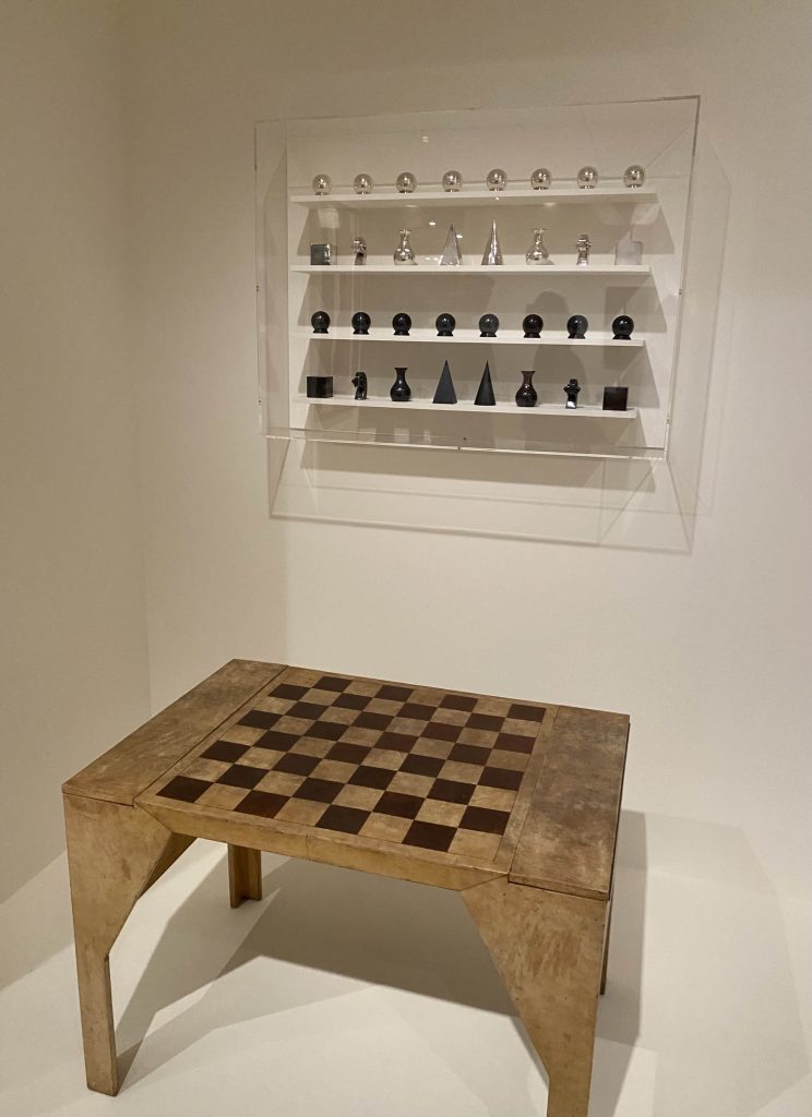
Jonathon Monk. One Moment in Time (Kitchen). 2002
This projector was also an extremely interesting part of the gallery. Rather than insert pictures, the artist instead put descriptions or simple words to represent the image that the viewer would imagine in their mind. The phrases also felt a bit nostalgic when I read them, because they were all things that are very familiar, especially as parts of childhood.
This floor had a section dedicated to surrealism, but nothing really spoke to me or invoked a deeper emotion. I just took pictures of what I thought was interesting or looked cool.
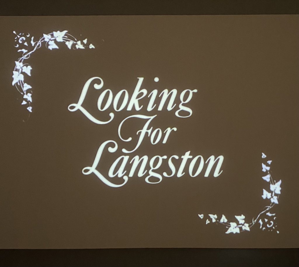
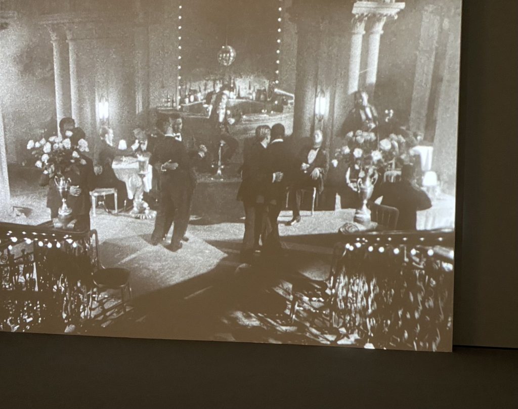
I watched a short film honoring Langston Hughes in this gallery.
I honestly did not have much interest in the 1950s-1970s collection on the 4th floor. It was mostly sculptures with some murals, but a trend I saw in each piece was the usage of everyday items, especially those that are otherwise overlooked by others. The artists took many of these materials and created some bizarre pieces, and I’m not sure what their intentions were when they created these. I did like a few pieces, but overall, these galleries did not speak to me as much as the ones on the 5th floor did.
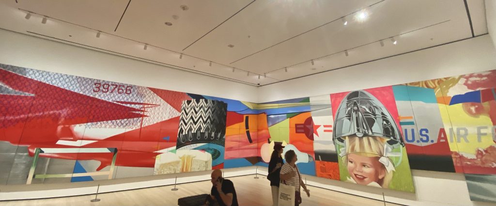
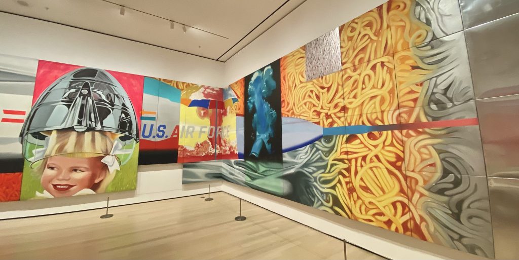
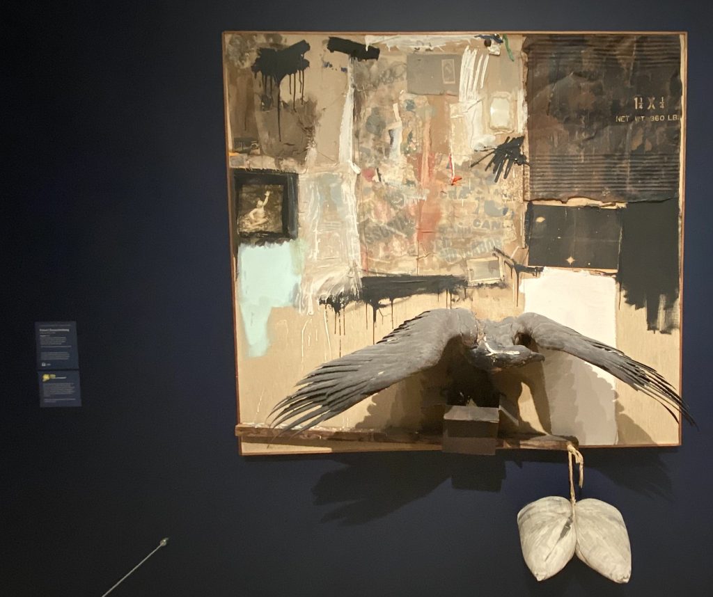
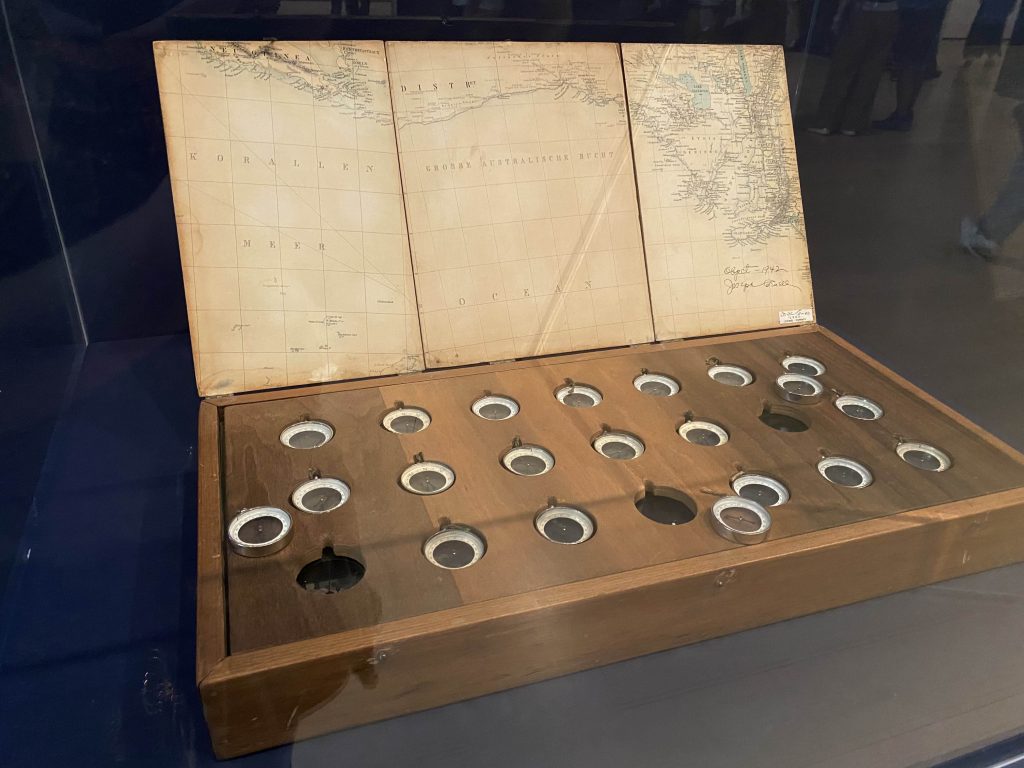
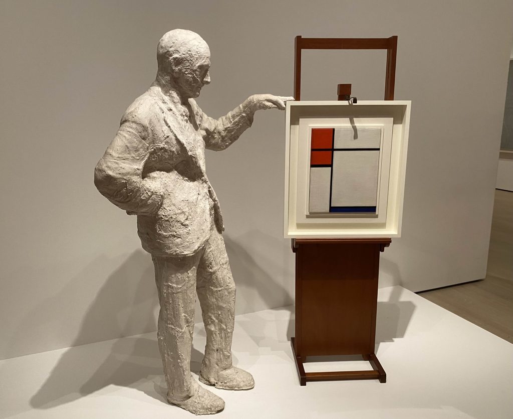
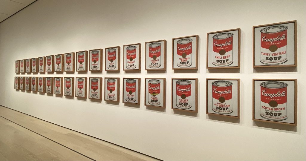
James Rosenquist. F-111. 1964-65Robert Rauschenberg. Canyon. 1959 – made from trash found around NYCJoseph Cornell. Object (Rosés des vents). 1942-53 – all of the compasses point in different directions.Robert Watts. Chrome Cabbage. 1964George Segal. Portrait of Sidney Janis with Mondrian Painting. 1967Andy Warhol. Campbell’s Soup Cans. 1962
On the 2nd floor, I did have a few pieces that I was interested in. What I noticed was that, in certain rooms with specific types of technology (like old televisions), I had a very high-pitched kind of ringing in my ears that decreased the further I walked away from them.
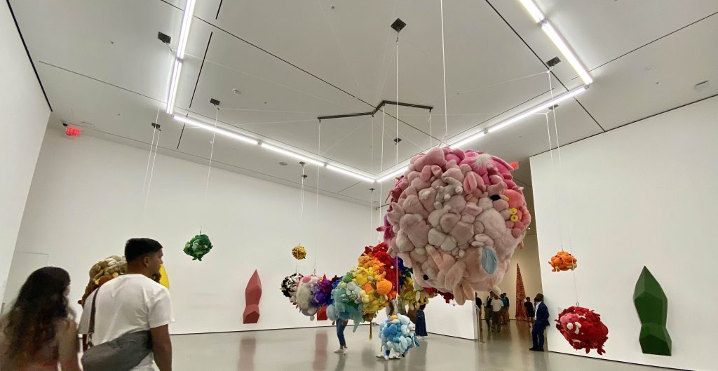
Another exhibit had scent incorporated into it. This one was kind of strange, as it was primarily large numbers of stuffed animals and dolls arranged by color and hung up in balls from the ceiling. There are contraptions set up on the walls of this exhibit which release pine-scented mist, which the artist chose as a criticism of consumerism and moral decline in mainstream culture. This one hurt my nose the longer I stayed because of the smell.
Mike Kelly. Deodorized Central Mass with Satellites. 1991-99
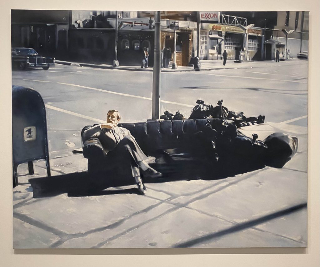
The last piece that I really liked was a piece that looked like a large photo from afar. However, when I walked closer to it, I noticed that it was a painting instead. It’s kind of bizarre, seeing the subject wear a suit and tie but sit on top of a discarded couch next to piles of trash.
Martin Kippenberger. Untitled from the series Dear Painter, Paint for Me. 1981
Finally, on the first floor, I did not feel interested in the galleries they had. They had a life-sized capsule room, replicating a design by Japanese architect Kisho Kurokawa as part of the Nakagin Tower in Tokyo. This exhibit was very small.
The experience in the museum was fine overall. I feel like the organization of the galleries is a little confusing. It was almost like a maze, and I got lost a few times between galleries. Something I found interesting was how many of the individual art pieces, especially sculptures, have their description and artist located on the nearest wall rather than directly on its case or beside it. The museum also seemed to intend for an audio map to be a major part of the experience as most of the descriptions had information about this, but I did not experience this for myself.
I might revisit this museum in the future if they have new exhibits or galleries. However, not a lot of the art on display really spoke to me, and I lost some motivation to go through every gallery that I could on each floor after I finished the 4th. The other museum-goers also blocked the view for a lot of the pieces, so it was difficult to get a better look at them.


