I went to the Whitney Museum of American Art. Tickets were free for people 25 and under so that was a plus! It was super easy to get in, they just checked my bag and scanned my ticket. Each floor seemed to have a different theme or the works of mostly one artist. There was a pretty wide array of kinds of art, including paintings, photographs, videos, audio, and sculptures.
Every floor was almost a whole other environment because some were a lot quieter/louder. I felt like I had to whisper on the first floor whereas the next was pretty lively.
Some themes I noticed were ASL, African-American and Native American cultures. I’m sure there were others but I noticed these the most.
Some paintings were more modern and abstract while others were a more traditional style. I personally liked the ones with a lot of color and texture.
Loved this so much. I think glass in art is so pretty and I loved how there were so many different sizes of the orbs.
This blog post won’t let me upload the photo I have but there was this one animation of some kind of terrarium (I don’t even know how to describe it) but it was looped and had an audio that sounded like water and it was so captivating I could have sat there for an hour.
Overall, I enjoyed this trip. I will be honest though, I didn’t really “get” a lot of the pieces but they were still nice to look at. I liked how the plainness of the actual rooms let the art shine but I do wish there was a liiittle more to them.
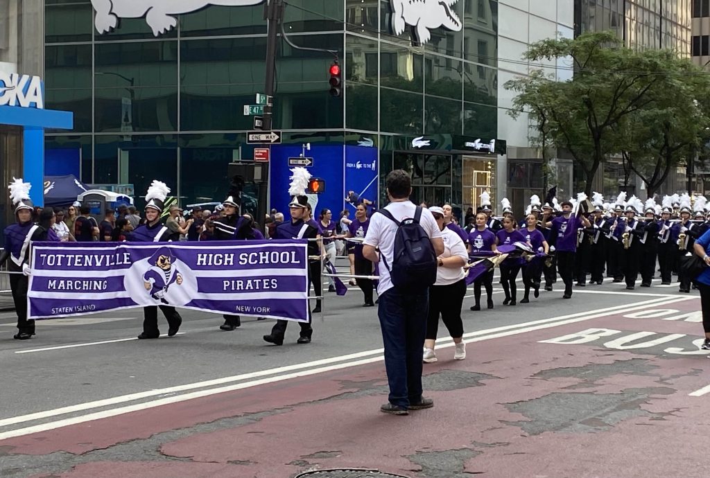
For my independent museum visit, I visited the Museum of Modern Art. I happened to arrive early enough to watch the Labor Day Parade as well, which passed by the front of the museum, and saw my high school’s marching band perform in the parade. The parade itself was fine, but there were a lot of obnoxious whistles and airhorns this year, which ruined the experience.
The museum staff were very professional, and it was easy to get the ticket. I didn’t interact with them much, but I saw that they helped a lot of the other guests when they had any questions.
The museum has 6 floors, 5 of which have galleries. The 6th floor is a café. I only looked at the galleries on floors 1, 2, 4, and 5. There were some galleries on the 3rd floor, but the stairs I took did not have any gallery access for this floor, so I ended up looking at the other galleries instead. The time periods represented by each collection increase from floor 5 to 1, with floor 5 covering the 1880s-1940s and floor 2 covering 1980s to the present. I started from the 5th floor.
The 5th floor has a wide variety of artwork, including galleries dedicated to photography, surrealist artwork, and sculptures. Portions of the floor are dedicated to art produced as commentary on war and race.
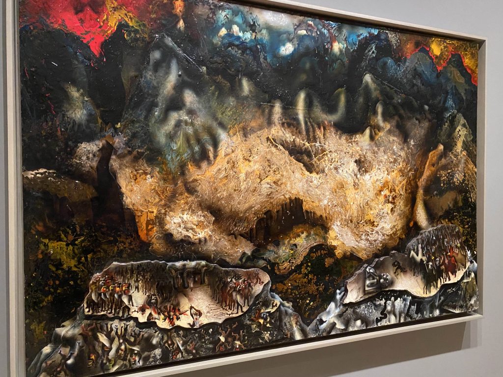
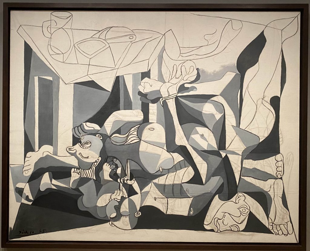
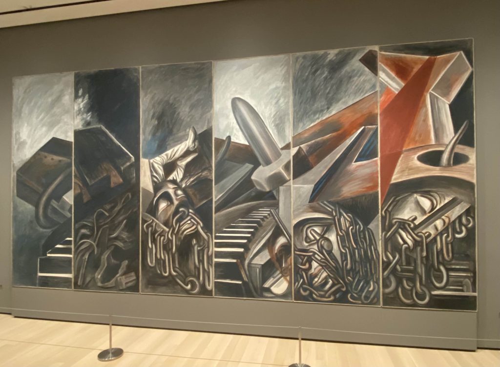
David Alfaro Siqueiros. Collective Suicide. 1936Pablo Picasso. The Charnel House. 1944-45José Clemente Orozco. Dive Bomber and Tank. 1940
These 3 artworks immediately caught my attention in the first section. They all depicted the hopelessness of life during war. The shapes on each piece are almost indistinguishable, all overlapping or melting into each other like they’re being tangled together. The style varies but they are all very dramatic and eye-catching. This part of the gallery did make me feel a little disturbed because of the themes of war and destruction, as well as the dramatic, dark colors used by each artist. I also noticed that some used different mediums and textures, like the piece by Siqueiros shown above, which was done primarily on wood and had elevated portions of the artwork.
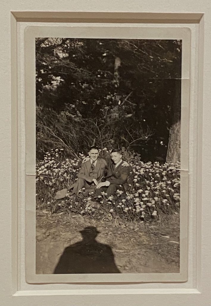
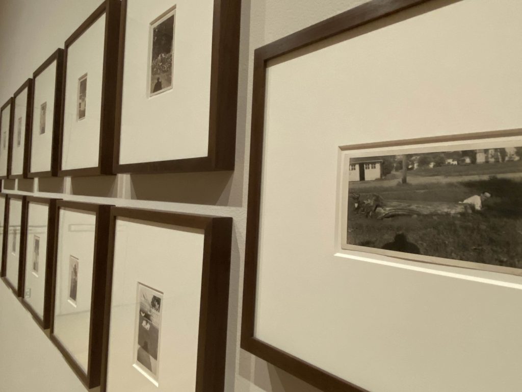
The gallery on the 5th floor that I really liked was the photography. All of the photos were of various people and you could tell that they are all unique, but they all seem like ordinary people with how they pose with one another and do mundane things.
A particular set of photos really caught my attention, shown below.
These photos are by an unknown photographer, mostly taken between 1935 and 1951, with two being from 1900 and 1916 respectively. When observing each photograph, it’s clear that the subjects are often the same people even though many years have passed.
What really stood out to me about this set of photos is the fact that the shadow of the photographer is always visible at the bottom. They mainly stood to the side and faced the camera towards the people in the photos, and sometimes they’d wear a hat, but might not have joined them in the photos. While the subjects are posing or having fun, the photographer is always watching and capturing the moment with a camera, and the presence of their shadow makes the photos feel more ordinary in a way. A majority of the photos in this gallery were very ordinary.
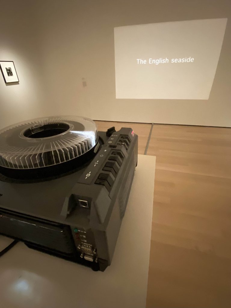
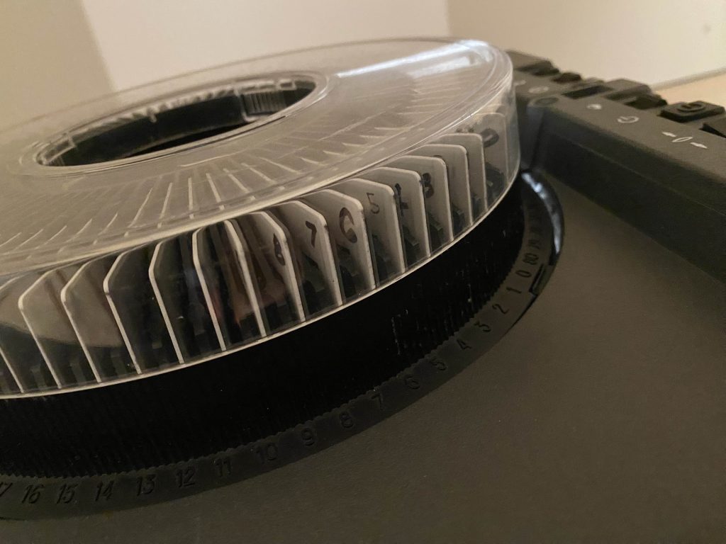
Jonathon Monk. One Moment in Time (Kitchen). 2002
This projector was also an extremely interesting part of the gallery. Rather than insert pictures, the artist instead put descriptions or simple words to represent the image that the viewer would imagine in their mind. The phrases also felt a bit nostalgic when I read them, because they were all things that are very familiar, especially as parts of childhood.
This floor had a section dedicated to surrealism, but nothing really spoke to me or invoked a deeper emotion. I just took pictures of what I thought was interesting or looked cool.
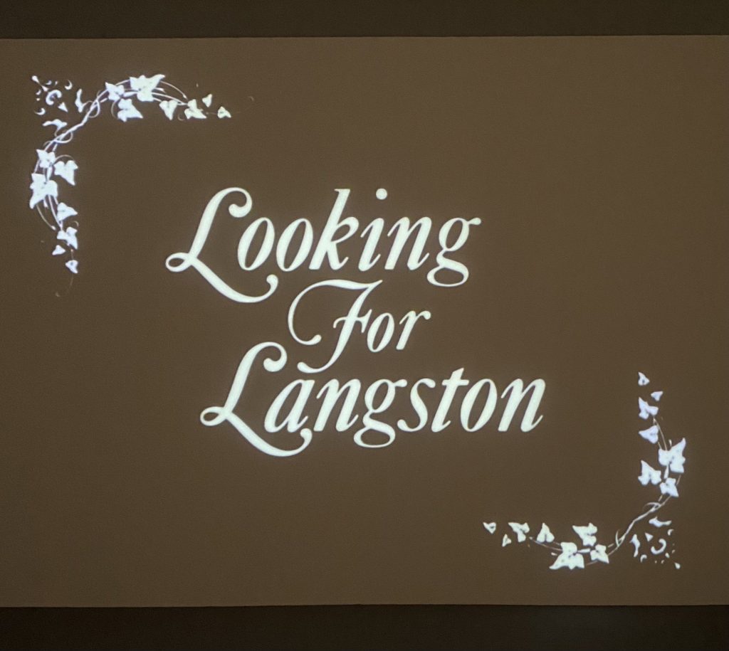
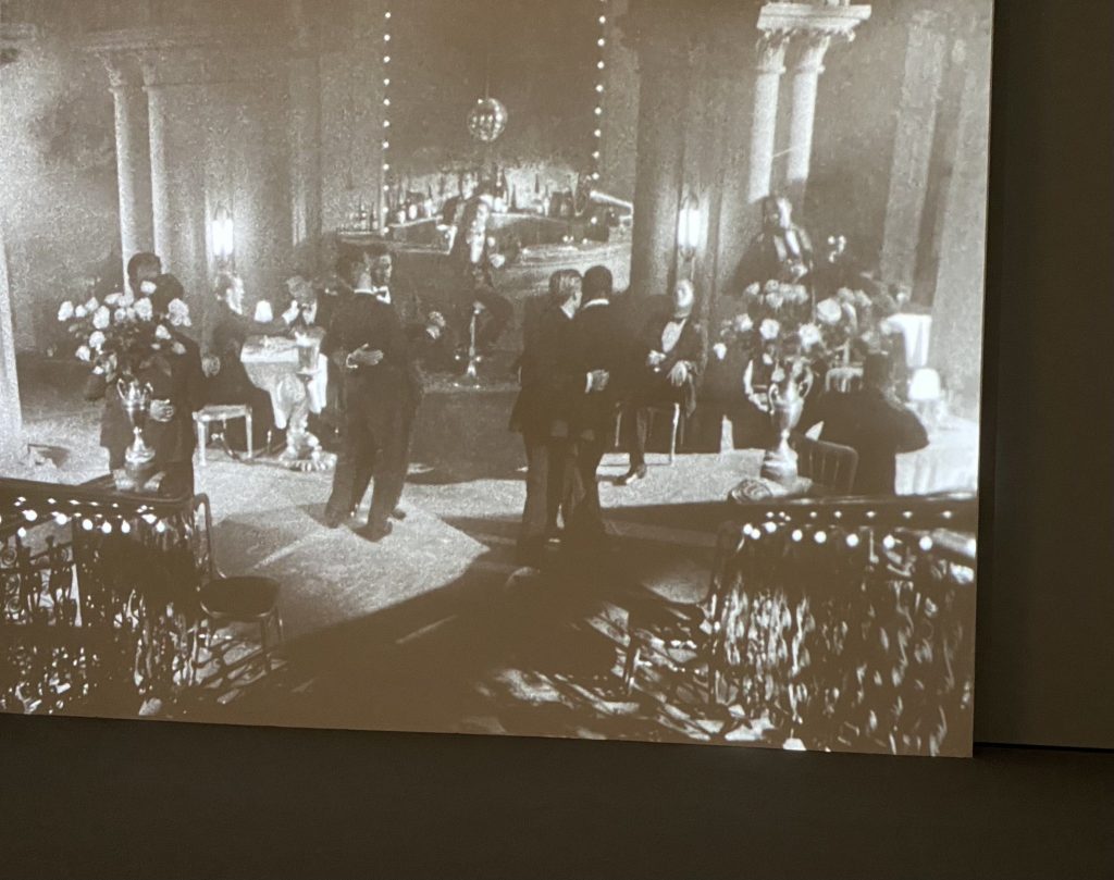
I watched a short film honoring Langston Hughes in this gallery.
I honestly did not have much interest in the 1950s-1970s collection on the 4th floor. It was mostly sculptures with some murals, but a trend I saw in each piece was the usage of everyday items, especially those that are otherwise overlooked by others. The artists took many of these materials and created some bizarre pieces, and I’m not sure what their intentions were when they created these. I did like a few pieces, but overall, these galleries did not speak to me as much as the ones on the 5th floor did.
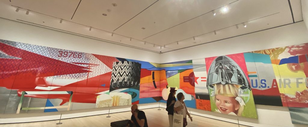
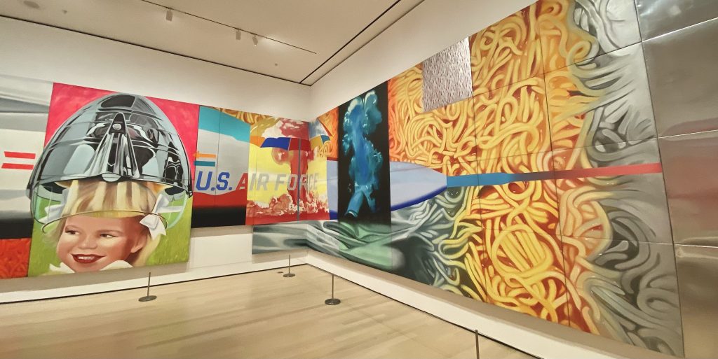
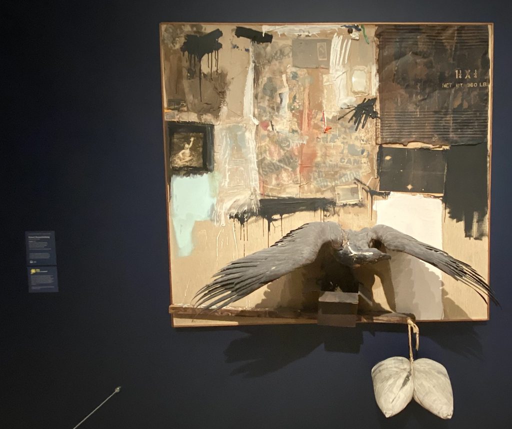
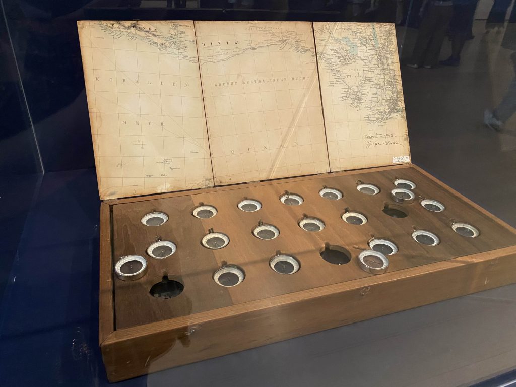
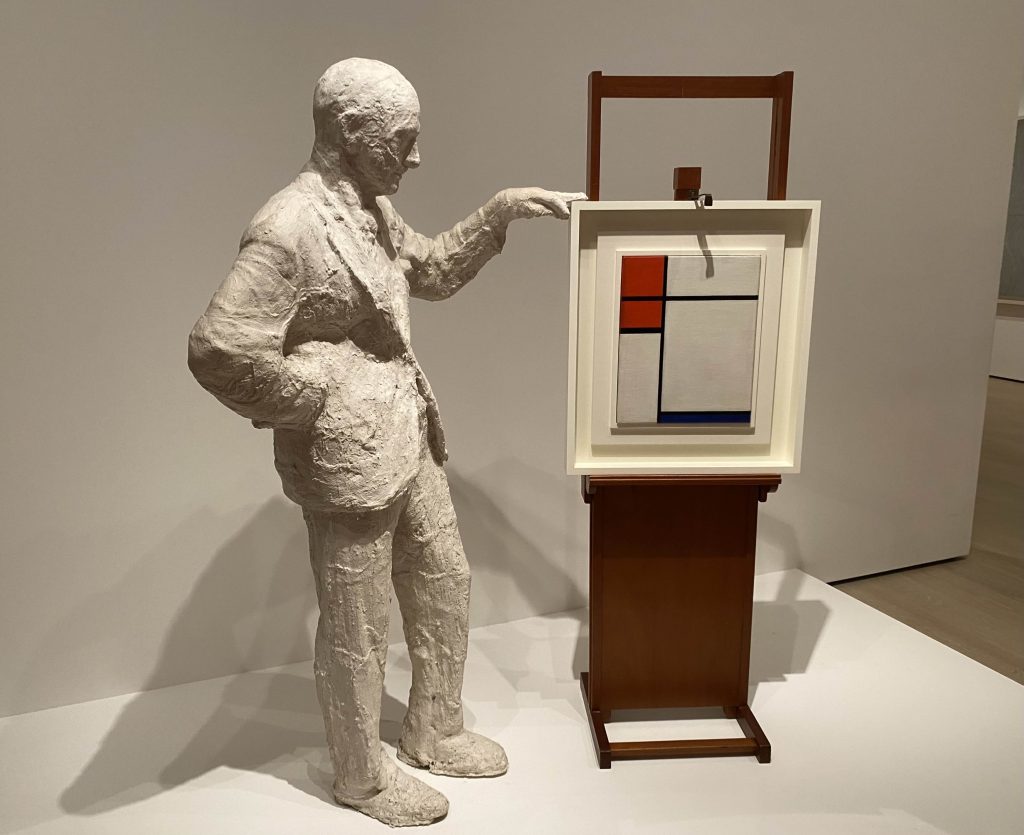
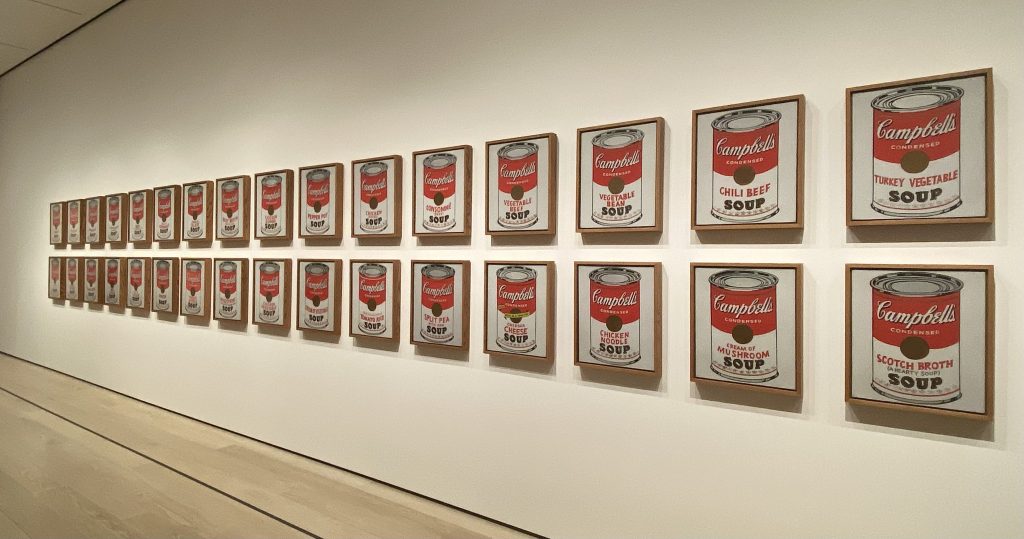
James Rosenquist. F-111. 1964-65Robert Rauschenberg. Canyon. 1959 – made from trash found around NYCJoseph Cornell. Object (Rosés des vents). 1942-53 – all of the compasses point in different directions.Robert Watts. Chrome Cabbage. 1964George Segal. Portrait of Sidney Janis with Mondrian Painting. 1967Andy Warhol. Campbell’s Soup Cans. 1962
On the 2nd floor, I did have a few pieces that I was interested in. What I noticed was that, in certain rooms with specific types of technology (like old televisions), I had a very high-pitched kind of ringing in my ears that decreased the further I walked away from them.
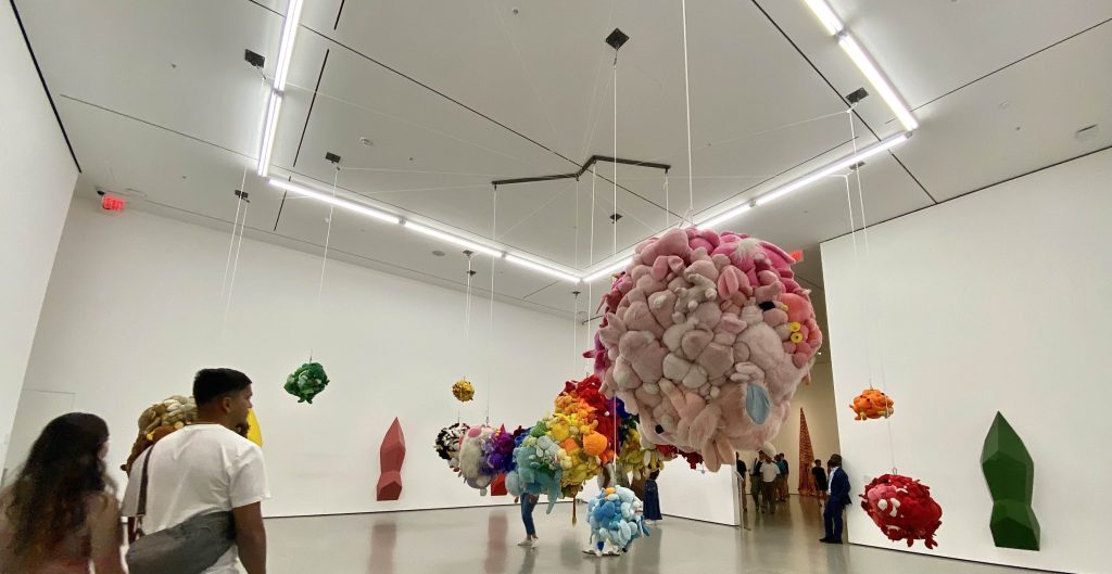
Another exhibit had scent incorporated into it. This one was kind of strange, as it was primarily large numbers of stuffed animals and dolls arranged by color and hung up in balls from the ceiling. There are contraptions set up on the walls of this exhibit which release pine-scented mist, which the artist chose as a criticism of consumerism and moral decline in mainstream culture. This one hurt my nose the longer I stayed because of the smell.
Mike Kelly. Deodorized Central Mass with Satellites. 1991-99
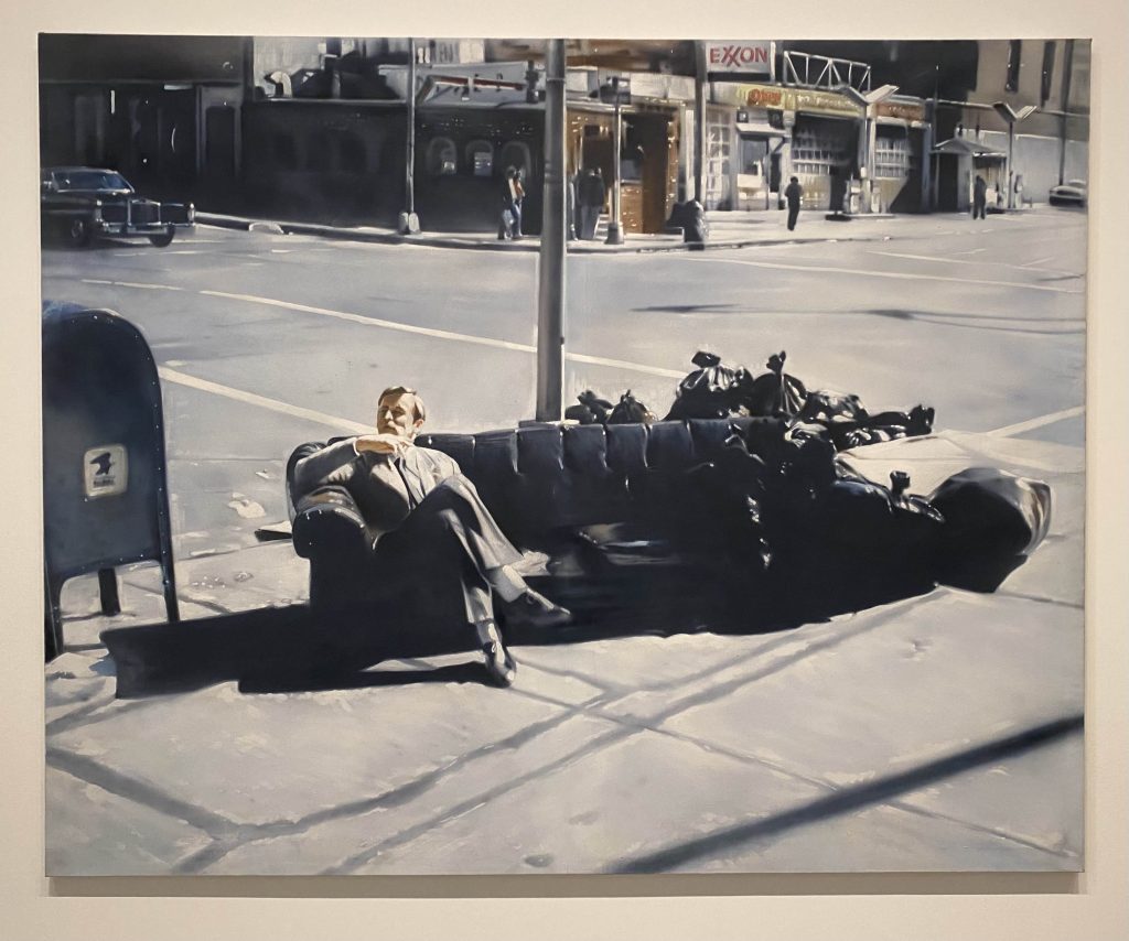
The last piece that I really liked was a piece that looked like a large photo from afar. However, when I walked closer to it, I noticed that it was a painting instead. It’s kind of bizarre, seeing the subject wear a suit and tie but sit on top of a discarded couch next to piles of trash.
Martin Kippenberger. Untitled from the series Dear Painter, Paint for Me. 1981
Finally, on the first floor, I did not feel interested in the galleries they had. They had a life-sized capsule room, replicating a design by Japanese architect Kisho Kurokawa as part of the Nakagin Tower in Tokyo. This exhibit was very small.
The experience in the museum was fine overall. I feel like the organization of the galleries is a little confusing. It was almost like a maze, and I got lost a few times between galleries. Something I found interesting was how many of the individual art pieces, especially sculptures, have their description and artist located on the nearest wall rather than directly on its case or beside it. The museum also seemed to intend for an audio map to be a major part of the experience as most of the descriptions had information about this, but I did not experience this for myself.
I might revisit this museum in the future if they have new exhibits or galleries. However, not a lot of the art on display really spoke to me, and I lost some motivation to go through every gallery that I could on each floor after I finished the 4th. The other museum-goers also blocked the view for a lot of the pieces, so it was difficult to get a better look at them.
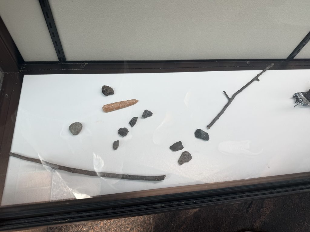
In 1P Jenna, Lukasz, Nicholas, and Sofia found a display of sticks and stones that were made to look like a melted snowman. Here are our thoughts:
Jenna:
This work definitely speaks to me. It makes me think of the end of winter. This end, to many, represents hope and warmer weather to come, but to this little guy it meant his time has come to end and that makes me realize that an event that is great to one could be detrimental to another.
Lukasz:
The snowman is a hidden treasure found in the wide lobby of 1P. Giving into the style of a melted snowman, it lies in the display case that presents the talents of CSI Students. You have to go out of your way to find it — not like a painting or wire sculptures. It is just one of the hidden treasures of CSI, and that is what constitutes the beauty of the CSI campus, which is secretly decorated with a variety of hidden treasures. The melted snowman is a true representation of CSI.
Nicholas:
The person who put this here was someone who was feeling very sentimental and wanted to immortalize the feeling of despair that they were experiencing. This is represented in the snowman stuck in its sad state, as it has melted and it has lost its form/shape. This relates to the person who put it here, someone who also feels lost and stuck in their ways.
Sofia:
When I was a kid, I would always wait for there to be enough snow on the ground to make a snowman. There was something so magical about creating something so fleeting. When the sun rose and the snow melted only the memory of the creation remained. To me this symbolizes the bittersweetness of growing up and undergoing changes. Change means the end of something familiar, but it also marks the start of something new. I think the melted snowman was made to immortalize a transition of season. To show how your past can guide your future.
The image that we saw in the Library (of a black and white figure reaching upwards as though they were drowning) spoke to us profoundly, as it symbolizes a struggle which we often endure in our inability to control our lives.
We understood it, but it didn’t really speak to us and we didn’t think it relates to CSI as it did not reflect any of the opportunities CSI often awards its students, and, on the contrary, indicated themes laced with desperation.
The work in question had no apparent meaning to any of us when we saw it. It did not invoke any emotion, and although we understood that it was about struggling and feeling stuck in place, it felt very out of place and juxtaposed within the campus library.
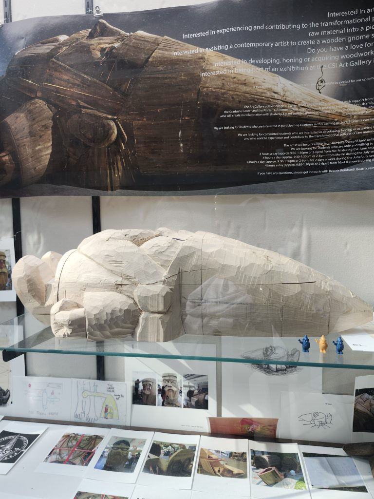
Khadijah Shoaab: The gnome spoke to me in a sense of nostalgia. I used to watch a cartoon show as kid called Gravity Falls and it had many Gnomes throughout the show and so seeing a miniature version of a ginormous wooden Gnome spoke to my childhood. I believe it does represent CSI in the sense that it is made up of so many different parts but appears as a whole just like the dolphin community. I also think the little 3d printed gnomes also symbolize us as a freshman class entering a huge new world. I believe a CSI student created the gnome out of wood in a forest for a art project because we found it in the art building. The sheer scale of the gnome in a setting such as a forest does imply some symbolism.
Mehdina Nimatova: The gnome speaks to me because on first glance it’s nothing crazy but once you look at the other components you realize it was part of something much bigger, from the size of the larger piece to the number of people who worked on it. There was just a lot more than what met the eye.
I do think it represents our campus because we are all part of something bigger than ourselves and play our own roles here.
I think it’s here because a huge group of people came together to make it happen. They all contributed to make this huge gnome….
Anjali Nair: This artwork doesn’t necessarily speak to me because it doesn’t connect to anything I have seen before in my life. I do think that the piece is very interesting where so much effort and minds went into creating it. I think it represents out campus as it shows the power of collaboration and putting your minds together to create this creation and the little gnomes represent us students while the big gnome is our campus. I think it is there because the creators went to CSI and created it for themselves as well as for a project
Jordana Caserta: This piece of art speaks to me because it was interesting to see the different steps that were taken to make a really cool piece. I also like the little miniature versions in front of the large gnome. Honestly, this piece reminds me of my childhood and innocence. I think this piece can represent our campus because the little gnomes can represent the students and the large gnome can represent the campus itself. The little gnomes being different colors represents diversity, but the same idea of “gnome” represents us all being CSI dolphins.
I think this artwork was here because someone from the school created it and wanted to display it. The person who created it was most likely a person who went here and wanted it to be here on display
Felicia Cruciata:How the art “speaks to me”:
The gnome speaks to me because at first, I didn’t much of the gnome but when I got a closer look at the gnome I saw everything that went into it. I saw how many people worked to the creation of the gnome and how big this project was in both size and contribution.
Does this represent campus?
I think the gnome does represent the campus it took a community to create the gnome and CSI is a community.
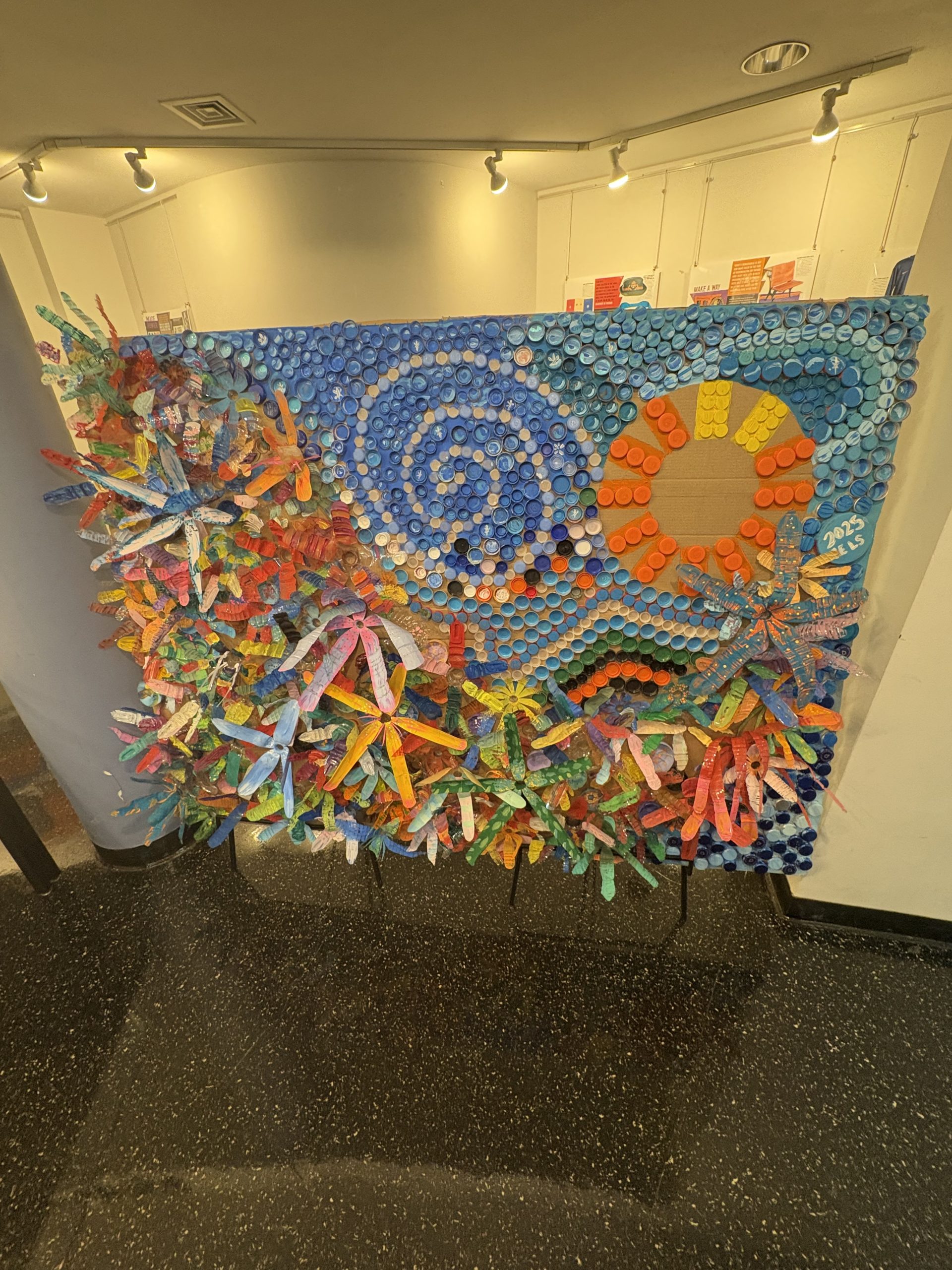
We don’t think this art piece spoke to us—although a good use of reusable materials, we were unable to connect or recognize its deeper meaning and connect to it. Nevertheless, we all thought it was pretty, and a good demonstration of color use.
We think it represents the campus because it uses plastic, single-use materials and turned it into something displayable, and CSI is all about green-energy and conservation of resources and energy. It also is colorful and vibrant, which (when the campus is alive), is a good look into how exciting the events can be here.
We think it’s there because it was a club or class project here, and the library is displaying it to show off what the class is doing and help others appreciate the class’s artist ingenuity. It was put there by CSI CELS 2025.


