To start, I wanted to talk briefly about my interpretation and experience at the opera.
Firstly, unfortunately I was not a fan. I felt like I couldn’t truly appreciate the story because I kept having to look down, and then the words translated just didn’t make sense to me. I thought the sets and singing were beautiful, but I don’t think I can ever fully emerge myself in opera because of this lack of “spiritual communication”.
But, after watching Rent, the similarities were so noticeable. I mean, some of the characters even shared names. They also have the same thematic setting, with poor artists trying to survive among brutal class divisions. We also see in La Boheme how hard it is for the boys to find treatment for Mimi because of their status, and in Rent we see the same treatment but due to AIDS and the scare that caused in the 90s. I also think La Boheme was more tragic, and tried to romanticize this tragedy of way of life, while Rent criticized it a little more. Rent is also obviously more modernized, but it’s adjusted well to modern issues. 1800s Paris isn’t exactly relevant in our day and age, but the story it’s telling is still the story of many in NYC, especially during the time period that Rent is set in. I loved rent, and I hope I can see it performed live at least once, and I loved how Johnathan Larson used La Boheme and its core “values” to portray something so relevant. I don’t like watching La Boheme, but Rent gave me more appreciation for it, as Rent “communicated” with me. And I think that’s what makes Art different in everyone’s eyes. Because I wouldn’t consider La Boheme my style of “art”, but the man who sat in front of us was so moved by the opera, While Rent spoke to me and moved me emotionally. And I think that speaks a lot about what this class is about, and I enjoyed it as our last blog.
Category: Uncategorized
-
La Boheme vs Rent
I have never watched an opera in my life. To be honest, I never thought I was going to. The whole concept seemed a little outdated to me. That was until I actually watched it. Watching La Boheme was absolutely beautiful. From the set design to the costumes, it was genuinely impressive. Also, the stage was unbelievable. The way that there were two levels to the stage along with realistic set designs. I was blown away. It was still pretty boring since my attention span is short. So, listening to people sing one word for more than three seconds was not the perfect fit for me.
In comparison to Rent, I would have to say I enjoyed the opera more. Rent was too real for me if that makes sense. It was too much about survival, activism and politics. I’d have to say I enjoyed the romanticized bohemian life that La Boheme expressed. The way that the artists were able to find beauty despite their hardship was very poetic. Rent, in contrast, was a lot grittier and more political. I definitely enjoyed the magical and fairy tale feeling of La Boheme in comparison to Rent.
-
Identity mask

oplus_2097184 The background is Ukrainian symbol Tryzub (Trident). On the mask, I put things important to me: family and my home country. I also drew some things I enjoy: tennis, chess, sports, math. I did it with some help of my little sister who was excited when she heard about this project.
-
Rent & La Boheme
When choosing between the two, I would have to say I gravitated and enjoyed Rent much more than La Boheme. I could actually grasp the theme of the musical and I enjoyed the modernity of it as well. Watching the Opera… I will say I didn’t go in to it very excited, so that may have added to my overall dislike of the experience. The opera being in Italian, was cool, to hear a different language sung in such an articulated way. However, having to read the little word screen and watch them on stage was too much for me. Even when I did read, it didn’t entirely make since to me when looking at them on stage, like the words didn’t match the actions. I will say, the sets and costumes were amazing, the illusion of them being in a room at the top of the house was amazing.
To contrast the two, the Opera is based in Paris in the 19th century while the musical is based in NYC in the 20th century. Despite that, they both share the message of showing people figuring out their life during difficult times. For instance, with Mimi in La Boheme, she passed due to Tuberculosis, and in Rent, Mimi and Roger have HIV and Tom and Angel have AIDS. The changes in diseases properly reflects the musical adapting to modern times and making it more relatable or emotion provoking to the audience.
-
Identity Mask

I don’t really think my mask gives off much in terms of my identity, at least visually. It was pretty difficult to decide what I wanted to do with it, but I eventually settled on this design (you can tell that I changed my mind in the middle of one attempt because of the uneven parts of the mask, where I tried using clay to alter the face shape a bit).
The colors used on the mask were mostly because I liked these colors. Green is my favorite color, and I also like blue and white. The red and pink flowers (red is a bit hard to see here) looked nice, so I got them for this project. There are also patterns painted on, as well as wires to string the flowers onto the mask, which represents my arts and crafts hobby.
The mask design itself is based on dàn (旦), which refers to the female roles in Beijing opera. There is no specific version that I based my mask off of, but I did have some inspiration from “The Drunken Concubine,” a famous opera about one of the Four Beauties of ancient China, Yang Yuhuan, for the overall design. I didn’t originally plan on using a Beijing opera style of “makeup” for this mask, but was reminded of it when I was researching for the artist research paper. I also really like the overall style of Beijing opera, and it reminds me of my grandfather, who passed away in 2013. My first exposure to Beijing opera was when he took me to the theater near our house in China when I was little.
I planned to use fake flowers to decorate my mask for a while, but other than me liking flowers, there is a bit of a cultural reason to them as well. There is an old tradition in my family (and I believe in the region where my family is from) where flowers would be given to a child when they turn 16: boys receive white or light-colored flowers, while girls received red, pink, or purple flowers. I included white, pink, and blue flowers for a specific reason based on this tradition, as well as myself. The red and pink flowers represent my identity as the daughter of my family, while the white ones represent my (somewhat) discomfort with that idea, since I do not fully see myself as a daughter. The blue flowers were not included in the tradition, but I chose to see them as an “in between” of being a son and a daughter, even if it’s just a one-time gift of flowers that I received years ago. I did ask around to see if any of my Chinese friends knew about this tradition, but it seems to be regional, and the flower colors differ from family to family, so it’s kind of silly. Here, it’s just a bit of my personal reaction to this tradition when I experienced it at 16. The flowers are also arranged in a way that resembles a kind of headdress an opera character would wear.
There was an idea to include designs similar to what you would see on fine china, but that was too complicated. I kind of had that idea with the patterns, but it’s not the same.
-
Identity Mask 🎭

I chose to theme my identity mask around my love for theater. I included six of my favorite musicals on the mask.Three of the shows, Mamma Mia, Little Shop of Horrors, and Grease, were performed at my high school. These productions are especially meaningful to me because I worked on the tech crew and became close with everyone in the theater company. All six of the shows are Broadway musicals. I did not see all of them in person, but they all moved me. The shows I saw in person are Wicked and Mamma Mia. Wicked is my favorite musical because it explores the complex themes of friendship. All of the musicals have phenomenal music and iconic storylines, which are a great way of promoting art in New York City.
I was inspired by the Comedy and Tragedy masks, which are two masks with frowning and smiling faces. There are many modern interpretations of those masks, so I designed my mask off of the blue and red version. I painted one side of the mask blue and the other side red, which is separated by a yellow strip of paper that says “Playbill.” The “Playbill” represents the program a person receives when they attend a Broadway show.
On the blue side of the mask, which would be the smiling face, I placed the Broadway shows with more uplifting themes, which are Grease, Wicked, and Mamma Mia. This contrasts with the red side, which would be the frowning face, where I put shows that involve death or violence. These shows are Little Shop of Horrors, Hamilton, and Rent. Together, these shows represent my love for theater and their influence on my life.
-
Identity Mask
Completing this project helped me to explore the role that art plays in my life as a New Yorker by being able to visualize the variety of cultures that are within me as well as the amount of culture that others inhabit within themselves. This made me reflect on the thousands on New Yorkers that are so complex individually. Everybody’s identity is so expansive where each separate category can sort of has its own identity within too that describes who we are. From the music we listen to, to the movies and shows that watch, each part identifies the individual.
-
Identity Mask
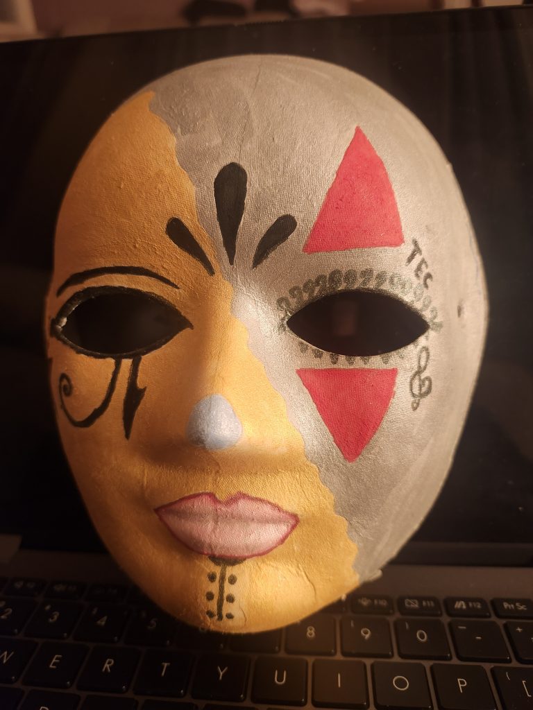
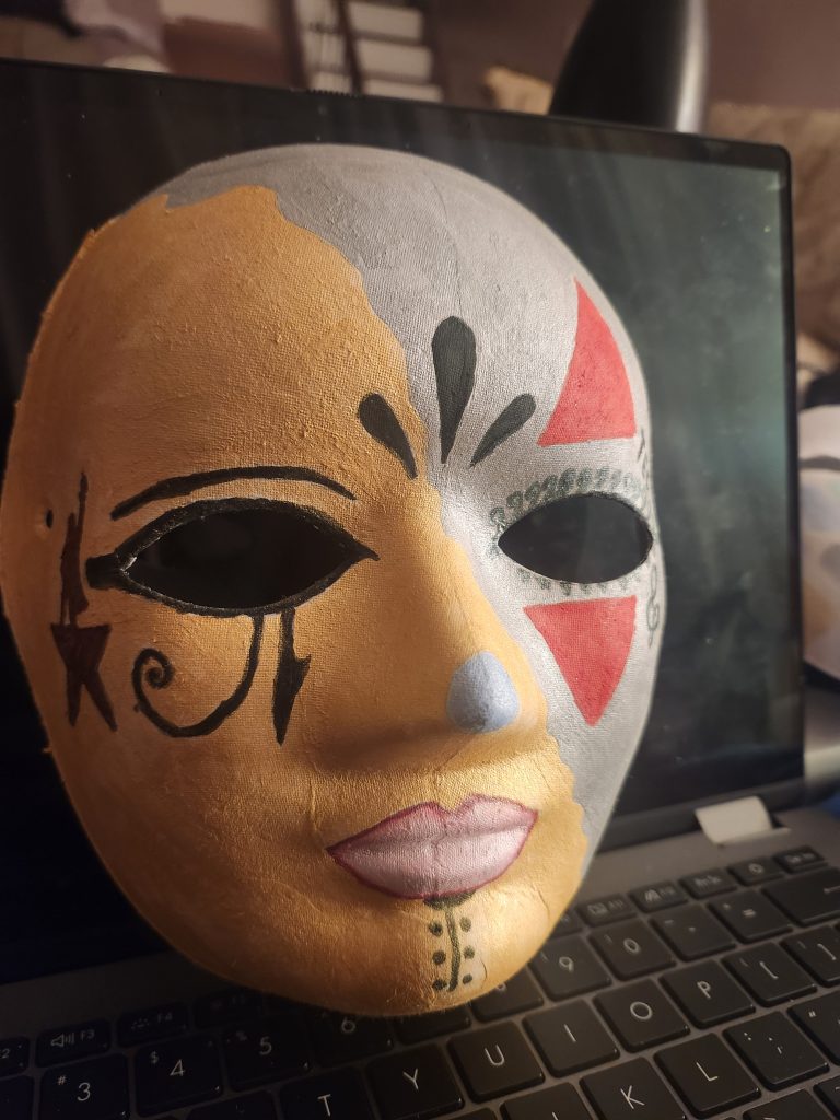
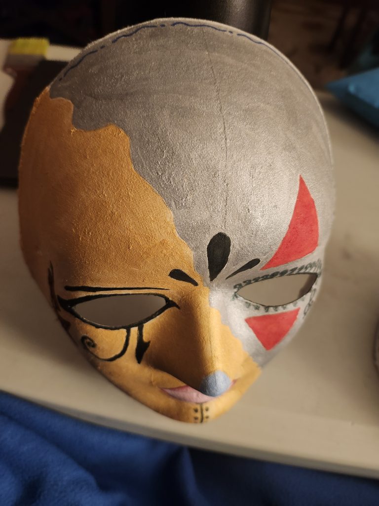
My mask doesn’t really look how I had originally envisioned it but it’s like a brainchild. To break it down, firstly the left eye is a pharaonic eye which is an iconic symbol of Egypt which is where I am from ethnically so I wanted to homage since it is a huge part of my life. Also the tribal chin tattoo is another reference to my north African heritage. Next to the eye you can see the Hamilton logo which symbolizes my recent-ish obsession with the Broadway play and all the songs on the album on Spotify. I chose a gold and silver half and half design to reference my love for jewelry and my silver rings and gold watches. I love mixing metals even though they might not look good together. I used water colors for this and they are actually glittery but you can’t see it that well in these photos. The three blots of black in the middle of the forehead is a little nod to my first anime which was Naruto. The red triangles are a call to the character shin-ah from Yona of the Dawn which is one of if not my favorite anime of all time and is a classic to rewatch for me when I miss home or need a break. They really need to make a second season :(. The curly and triangle abstract lashes and the lips are symbols of my love for makeup and how I view it as its own art form and is one of my favorite ways of self-expression. The TEC on the side of the right brow-bone is a reference to my favorite artist of all time Lil Tecca (best rapper ever). TEC is one of his album names. The music note is the most personal symbol of my mask. It represents my love for singing. It is my biggest way to de-stress and always makes me the happiest and it has been that way since I was little. The blue nose just felt very maximalist and that is how I would describe my style so that is why its there. There are also blue dainty design on top which should be flowers but I am not that good at drawing so I did it as a homage to the way my mom would dress me in florals for a bigggg chunk of my life.
-
Identity Mask
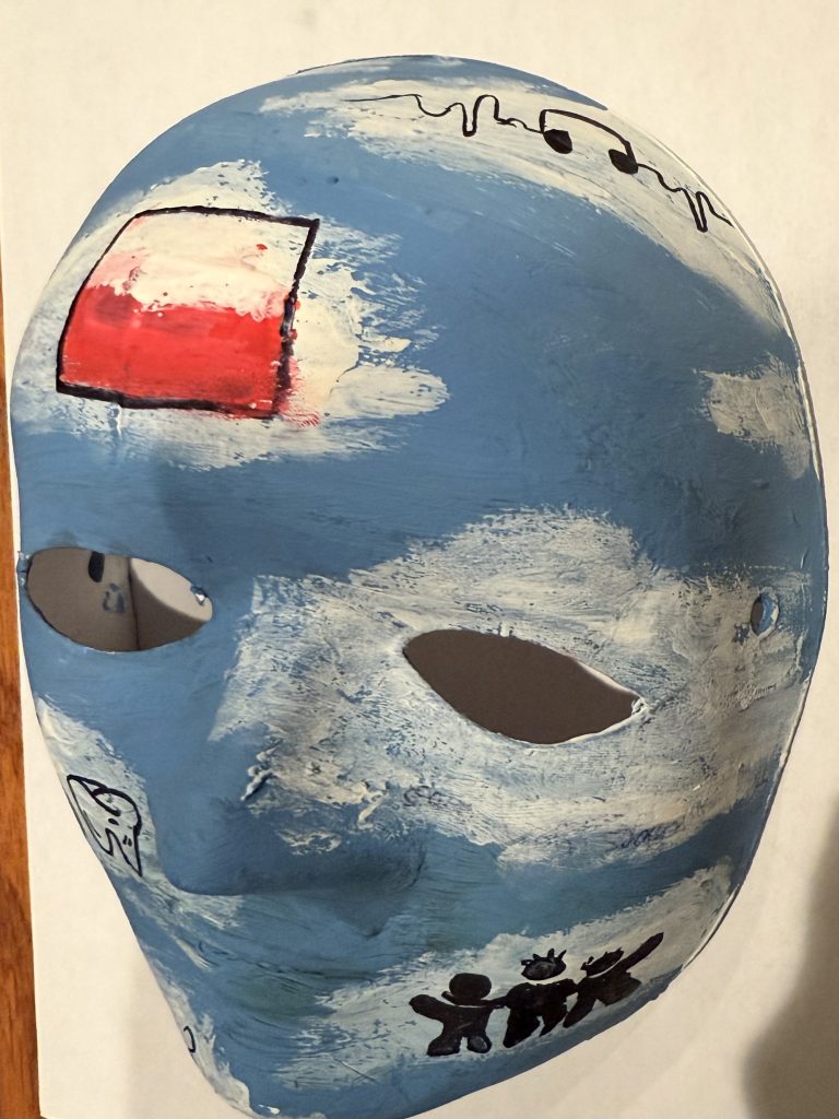

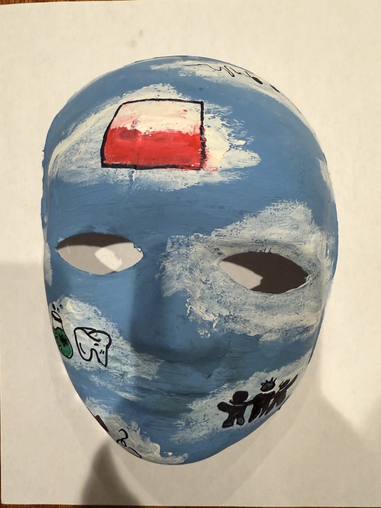
When asked about my identity and the things that make me who I am, I think about my personality, my aspirations, and my interests.
To begin, I decided to paint a background on the mask resembling that of a sky and clouds. To me, the sky shows that I have so many goals that I have the potential of achieving, and the clouds representing that life is not predictable, but I still have the ability of moving forward.
Next, I decided how I could symbolize the different aspects of my life. In each of the clouds, I placed a symbol of the things that make me the person who I am.
The first symbol that I decided to place was the Polish flag. I take deep pride in my Polish heritage, and it represents where my family comes from and the traditions that have shaped who I am. In Poland, family and community are some of the most valued parts of life, and I carry those values with me every day. To me, my family and the traditions that we have established are very important, as they center around gratitude and love for one another. Additionally, the Polish value of hospitality and care are very important to me, as I try to be of any help for others whenever it is possible.
The second and third symbol I decided to place was a laboratory flask and a tooth. Science is one of my interests and though it can be difficult, I love to see the different functions and properties of life that allow us to live and thrive. Personally, I have really enjoyed my chemistry and biology laboratory classes this semester, so these courses have built a much greater interest and appreciation for science. The tooth is another symbol I decided to put as I hope to become a dentist in the future. Personally, the hands-on and practical skills along with the human connection are some of the reasons I hope to become a dentist.
The fourth symbol I placed was a cross, resembling my Catholic faith. My faith has played a large role in life since I was a child. It has allowed me to find comfort during rough times and to find peace in prayer. Additionally, my faith has allowed me to continue to try to be the best version of myself that I can be.
The fifth symbol I placed was a trio of people. To me, this represents both family and friends. My family and friends are the people that ground me and appreciate life for what it is. I am very fortunate to have people in my life that are very caring and supportive, and this connection I have with my family and friends has made me the person who I am today.
The sixth symbol is a clothes hanger and a shirt, representing my love and interest for fashion. To me, fashion allows me to express myself and allow me to feel good about myself. I love being able to play with colors and structures and find myself through this.
Finally, the seventh symbol I placed was a pair of headphones. To me, music is a comfort that has helped me to get through tough times. Finding connection to an artist and their lyrics reminds me that life is a shared experience and that I am not alone in my struggles. I also just love listening to compositions and instrumentals of music, as these elements in music are very beautiful and captivating.
So, to me, my identity is one that branches off into so many aspects that appreciate life, connection, and human experience.
-
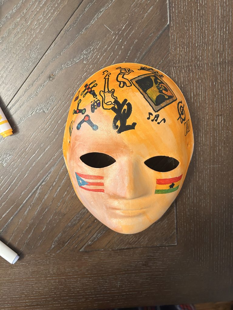
Identity Mask


This is my identity mask. I included a bunch of different things that I like to show that this is what makes up my personality. I included the Yankees logo because I am a diehard fan and talk about them probably every day. I included references to two of my favorite artist/ bands which is Mac Miller and Radiohead. I finally included references to two of my favorite manga in Chainsaw man and Berserk. I wanted to draw everything on the mask, then outline them in black to make them stand out and give it a black and white feel. I honestly wanted to draw more stuff but I didn’t have room to add anything else. It is also extremely difficult to draw on a curved, non flat surface like a face mask.