Evan Truskalo – Protest Art

The cause, or well, more of an issue in this case, that I picked, is the poverty on the North Shore of Staten Island. I feel like a lot of people in both NYC as well as Southern Staten Island overlook the borough as mostly a fairly well off classic suburbia of sorts. It is, after all, the borough with the second highest median household income behind Manhattan, but the North Shore’s issues throw a significant wrench in that notion. Parts of it have poverty rates nearly 3 times the rest of the island, and less than half the income—but let me not get carried away and turn this into a research paper. Still though, just through living here, and knowing people here, I see the struggles that my community goes through on a day-to-day basis. It frustrates and saddens me to see the economic, health, and nutritional insecurity that the North Shore experiences. The article I picked was titled “On North Shore, residents are more likely to be sick, poor and uninsured; efforts target health disparities”, and was about these socio-economic concerns.

Honestly, I was kind of stuck for a bit early on, because I had an idea from very early on, it was just difficult to find images from the magazines for it. The article itself only had one photo—which was a useful photo, don’t get me wrong— there wasn’t much else to supplement it, and the text printed out rather small. It was quite difficult to find decent imagery to include, not only is Staten Island not frequently reported on, but it was also difficult to find imagery related to economic insecurity, poor health, or just “poverty” generally, for lack of a better way of putting it.

I wanted to both literally and symbolically portray the island in two halves, between the poorer North and the richer South. On the bottom left hand corner, there’s the more vibrant, colorful, and lush photos (that are ACTUALLY of Staten Island, which was a nice find), that fall more in line with the typical, and mostly accurate, perception of Staten Island as a well-off suburban community. However, you have “an island in DIVISION” in cut out words that isolate those photos from the ones on the right-hand, which shows the stark contrast in economic condition. The young girl on the bottom right is at a dinner table, and my idea there is that her situation represents the food insecurity on Northern Staten Island. The photo of the suburban housing could represent the more dire housing situation in the North, and it also juxtaposes the vibrant, almost lavish portrayals of the South Shore houses that I have on the left.

The top right photo is of a person shopping for food (and is actually from a CUNY article about food insecurity, so I didn’t even have to stretch the meaning too much.) Inserting the image actually turned out quite a bit better than I thought it would, and I’m happy how the diagonal cut above the words of the article title and the black and white photos turned out, especially considering that I’m not too much of a physically-artsy person. To compensate for the lack of cut-out imagery early on, I did experiment with using markers and colored pencils to draw words or visual effects a bit? But honestly I really regret doing that, I had bad luck with the black marker I tried to use, it turned out more like a dark turquoise. On the top left, I cut up the article image to try to portray a shattered North Shore of sorts, but honestly I do regret that a bit too. I did like the title font size though, and I was able to use the key words of it to make a mock title for the collage “On the North Shore… sick, poor, and uninsured“ which I felt leaves a strong impact.

It was, admittedly, a little bit intentionally convenient for me to choose this topic, as I’m writing about food insecurity on the North Shore for the People of NYC’s final research paper. But this collage still gave me a new angle to look at it on. It honestly riled me up a bit while making it, and even now when I’m writing about it. Of course, this issue has always been important to me, but portraying it through an artistic lens recontextualized that importance, passion, and advocacy in a unique way that I don’t think I would’ve experienced otherwise. Our lives are driven by social and political issues and our art is no different. Art is, after all, a sign that you care about these social and political issues.

Evan Truskalo – Public Art


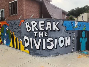
Everyday while commuting to the College of Staten Island, where Victory Boulevard and Westervelt Avenue intersect, I see a painted mural that sprawls along a brick wall. It pops visually, with many different colors, shapes, and art styles, but also symbolically. It’s a mural that serves as a protest against gun violence first and foremost, and also has many other pieces of symbolism about matters of racial equality, social unity, and concern over the environment. I wanted to discuss it because I’ve always enjoyed passing by that mural, and at least off the top of my head, I haven’t seen much else on Staten Island like it.

Public Art Evan TruskaloPublic Art Evan TruskaloPublic Art Evan Truskalo

As a quick aside, I also think it’s really great how the project came to be. It was effectively sanctioned and started by Canvas Institute, a youth-engagement non-for-profit, but it was 25 middle-school students that actually made the mural itself. I think that’s amazing, because from a young age, it teaches how social awareness can combine with art and one’s community. Even in a small way, it encourages advocacy and initiative in these students’ communities.

I do also really enjoy the piece aesthetic-wise. It’s varied and dynamic; there are multiple different colors, styles, and pieces of symbolism for the issues that it’s representing. The “BREAK THE DIVISION” written on the wall not only draws you in, but also portrays the central idea of the piece: to “take action against the world’s problems” and “to end the division among us”. The intent of the mural is to protest gun violence, but you can also see how it evolved to contain more ideas and pieces of symbolism: Racial equality, climate change, social unity, political advocacy, and I love how all of these ideas all tie back into the core themes of community awareness and “breaking the division”. There’s great, impactful imagery. The direct imagery of the mural, like the silhouette of a person with “EQUALITY” written on their face while locked in a cell, as well as the hands holding the protest signs, stands out a lot and it leaves a long-lasting impression.

I also think that the mural shows some of Staten Island’s, and New York City’s, culture and youth. There’s a tapestry of different colors, shapes, symbolism, and social commentaries, and it’s all wrapped together in a way that really stuck with me, honestly. It sets a mood of optimism, hope, and positivity that the newer generations are fighting back against all of these issues. Considering how Staten Island is a fair bit more conservative compared to the rest of NYC, it’s a pleasant surprise to see art like this. Because, really, this mural is a major example of why public art is so important, and should never be censored. A mural like this shows the unity and coming-together of a community, and how the members of that community want to show their passion for societal issues and concerns. It sets an inspiring example for everybody else in their community. Of course, there are people who don’t approve of this form of artistic protest— they may say it’s too political, controversial, or divisive. But to me, that’s all part of the point of public art: Certain styles, social commentaries, or themes, may be divisive or make us feel uncomfortable; they may challenge certain ideas or feelings we have, either towards the art itself, or what the art represents. And yet, challenging ideas is how we grow as both people and communities. Public art makes us reflect and think, whether it’s about something fairly minor, such as which art styles we like or dislike, or something as significant as the social, racial, and political issues of today.

Evan Truskalo – Queer Van Kult

The one question I asked when Queer Van Kult was over was about how difficult it was to host events or get LGBTQIA+ historical sites recognized, either in terms of social pushback (especially in conservative Staten Island), bureaucratic red tape, or financial considerations. They discussed how it was challenging to get funding, rent out spaces, find and fill those spaces with artifacts, etc. Something that also stood out to me is just the element of funding: The four (if I recall correctly) members of Queer Van Kult need to balance the project and the events they host with their jobs. How difficult is it to maintain their work ethics at work, as well as at Queer Van Kult and its events, collaborations, and galleries? Of course, these are all challenges inherent in building small-scale, community-focused groups. However, I wonder how many groups like Queer Van Kult have been attempted, and eventually failed or fell apart, because of the realities of not having the time or money to sustain themselves in the long-term. For every successful group like Queer Van Kult and the space that they’ve built, how many other groups have we never heard about, groups that may have faced, or continue to face, similar struggles?

I did also have a couple other questions to ask, but my group-mate and I combined got through most of the ones we brainstormed. There was one person in the other class who, if I’m remembering correctly, asked about the representation of transgender individuals and if Queer Van Kult would consider that representation, as well as how they may go about it to ensure that those individuals have an opportunity to make themselves heard. It was a very profound question that got me wondering about if, in an ideal world— with all the funding, time, staff, and resources, that Queer Van Kult could get their hands on— what might their goals or plans be for the future? What kinds of events might they hold, what people would they have interviews with, or what groups / members of the LGBTQIA+ community might they collaborate with? What other LGBTQIA+ art might they make or include in their events? I did have a couple other questions I wanted to ask and didn’t have the time to, but that’s inevitable. I was really curious about if there have been any specific artists that have inspired their mediums and styles throughout the years, either in their personal art or their art with Queer Van Kult. Mainly, though, I’m interested in knowing more about the process of getting an LGBTQIA+ historical site recognized. What financial considerations may there be, is it purely a matter of organizing / communicating with local or regional governments, or may there be other factors at play as well? What other sites they’ve worked on besides the Alice Austen House, either in the years before or since it was recognized?

Evan Truskalo – A Visit To The Society of Illustrators

On July 12th, 2026, I went to to the Aociety of Illustrators. I was there from roughly 2:30-4, and honestly, it was a stark contrast to most other museums that I’ve been to throughout my life. The scale of the building was condensed, but that conversely made the art shine so much brighter. Each individual piece stayed with me a fair deal more compared to a piece at the MoMA, for example. The SoI is almost comparable to the Alice Austen House in its size and scale: It has a cozy and warm atmosphere, there are only three floors / rooms, it’s sparse of people, quiet, and is quite spacious for the most part. You never need to worry about how much time you’re spending at a particular piece, or if you’re blocking someone’s view, etc. There was no real urgency or rush compared to that of a larger museum, which I really appreciated. At the MoMA, there were multiple times where I felt like I was blocking someone’s view, or taking too long at an exhibit, but that wasn’t the case at the Society of Illustrators.

The smaller scale of the museum was juxtaposed by the sheer amount of art on display at all times. It honestly overwhelmed me at first, but I really do love the amount and variety of art given the square footage— even on side corners that led to staff-only rooms, there were still illustrations and descriptions hung up. Compared to the MoMA, the Society of Illustrators had much more recent art made in the 2020s, which was a bit of a welcome surprise to see. It was neat to try to predict when certain pieces were made based on their medium and subject / theme. Speaking of subjects and themes, the SoI also has a large variety of socially focused art; whether it’s political cartoons, portrayals of war, or gender rights and gender identity. This was interesting to contrast with the MoMA, which I feel had less politically or socially advocatory art. The SoI is closer to the Alice Austen House in this way too, and even while writing this, it’s neat to see more similarities between the two museums. The artistic portrayal of Handmaid’s Tale covers by Corriere Della Sera also stood out to me. It was interesting because of how distinct it felt from the graphic novel, and the style honestly reminds me of certain cover illustrations of George Orwell’s 1984— it’s interesting, and almost fitting, really, for two portrayals of totalitarian dystopias to have certain stylistic overlaps.

The Hall of Aisles by Franklin Booth was one of the most standout pieces to me. The contrasting scales between the foreground and background, as well as the sheer detail in all layers of the drawing, is so impressive. I like the detail of the person in the foreground dominating the background figures and buildings, while the structure of the overarching building dominates them all. My eyes just kept wandering throughout the piece, because it’s just insane to me that so much detail is possible with pencil on paper drawing. I loved to see where the detail on the background began and ended, and I’m also interested in monumentalist architecture anyways, so this painting was enthralling to lay my eyes upon.

It’s interesting to see the variety in theme, method, and subject, in the pieces of the SoI, because I feel like it’s not too often that you see such dynamism in individual museum galleries. It almost reminds me of Alice’s photographs of everyday life in New York in terms of the visual variety. Comparing it to the MoMA, while there were differences between the individual exhibits, each gallery had overarching similarities, either in medium or theme—which is by no means a bad thing. In-fact, it can help the pacing and cohesion of a larger, or just more segmented, museum, like the MoMA or even the Alice Austen House. However, the SoI felt unique to go through because of the condensed placement of the art and how that complimented the art’s variety. From frame to frame, I didn’t really know what to expect, and I was excited to see what the next canvas had to offer. The tapestry of different art that makes up the SoI is probably my favorite aspect about it.

Hall of Aisles by Franklin Booth

Hall of Aisles by Franklin Booth

Hall of Aisles by Franklin Booth (The photos don’t do the work justice, sadly)

Evan Truskalo – A Visit To The Museum of Modern Art

On June 28, 2026, I visited the Museum of Modern Art in NYC. It was my first time visiting, and if I’m being honest, I’ve rarely been to museums in the past, with only a couple exceptions off the top of my head. With that in mind, I was really unsure what to expect regarding the minutia of the exhibit layouts, what kind of exhibits there’d be, etc. That said, I was able to explore a good bit of the MOMA. I stayed for roughly two hours, and explored two of its floors. I frequently went back to earlier exhibits to see if I’d have any new thoughts the second time, but on average I spent 5-10~ minutes per exhibit depending on the piece. There were so many unique pieces that I absolutely adored. I loved Monika Correa’s work “Roots 1”; the detail in the weaved pattern and the sharp contrast between the black and white stood out to me both visually as well as how unique it was compared to other pieces. Alexander Boghossian’s work, “Blue Composition”, is also beautiful and interesting to me because of how dynamic the painting can be, despite it mostly being just shades of white and blue. Louise Nevelson’s work “Sky Cathedral” also stands out from its height, depth, and her symbolic reasons for painting the entire piece black. Agosto Machado’s work, “Shrine”, is probably my favorite because of both how unique the piece itself is visually, as well as how it serves as a representation of Agosto’s personal life and his advocacy for the LGBTQIA+ community. It was nice to see a piece that was explicitly political and advocatory towards a part of life that’s unfortunately still regarded as an issue by many; it didn’t shy away from recent politics and social trends, and I’m glad for that: Art is, after all, political.

From the moment I saw the MOMA’s banners hanging on the side of the building, I wondered how to apply what Margaret Lindauer advocates for in “The Critical Museum Visitor”. To start, I felt mixed about the architecture of the museum. On the one hand, I was a bit underwhelmed by how the exterior and lobby almost gave off the impression of almost a corporate office-esc setting. But on the other hand, I think it could help the museum have a more, for lack of a better word, “neutral”, and less overbearing, atmosphere. This is similar to the individual galleries, where the environment is mostly a clean slate without many additional designs or color combinations. The monotone and pastel grays, whites, and dark blues, help each individual exhibit pop much more without running the risk of distraction. The smaller information plaques also help to not draw attention from the main pieces, but I do wonder if the small font size could be an issue for reading accessibility. On the note of plaques, I did find it a little disappointing that most of the information plaques are quite barren, with the obvious exceptions of the title, creator(s), and who gifted it / how it was received. The main reason I make a note of this, is because there are some plaques that do go into broader depth— either about the creator, the piece, or the historical context in which it was created— and it’s a shame that couldn’t be a more consistent standard to me, but hey, maybe I’m being unfair there. All of that said, the sheer variety and amount of creators, genres, pieces, and galleries, still made me thoroughly enjoy my time at the MOMA, and I’d love to go back anytime.

Roots 1 <-Roots 1, Monika Correa

Blue Composition <- Blue Composition, Alexander Boghossian

Sky Cathedral <- Sky Cathedral, Louise Nevelson

Shrine <- Shrine, Agosto Machado


Numbers and Trees <- Numbers and Trees, Charles Gaines

Unknown Pleasures <- Unknown Pleasures, Matthew Wong