Are transplants ruining NYC? – Kamila Ibanez

The cause I am supporting is the protest against wealthy investors, developers, and contractors who prioritize wealthy renters and out of state residents over native New Yorkers. There’s been a growing problem of “transplants,” or white collar workers who come to NYC for a temporary amount of time. As highlighted in the article, many longtime New Yorkers feel that jobs created by outside corporations are increasingly going to newcomers instead of people who have lived here for generations.

Are transplants ruining NYC?

The different elements I included show what I believe is the root of the problem, who and how it is allowed to happen. While New York is diverse, we live in pockets and only certain groups really intermingle and it is usually a means of economic ability.  ‘Transplants’ have just highlighted an existing problem in NYC, the city’s priority of wealth and whiteness. The city allows larger corporations to buy up local businesses and replace them with chains while giving tax breaks to luxury developments. That’s why I chose to highlight the construction happening throughout Manhattan and Queens, along with words like “housing,” “gentrification,” “tax breaks,” and “billionaires.” I wanted people to connect these issues together instead of seeing them as separate problems.

I made the article’s question the centerpiece of my collage and around  it I placed images of construction, luxury housing, and development to show what is changing the city. I also crossed out the faces of people of color to symbolize the displacement of longtime New Yorkers. I intentionally left the white faces untouched because I wanted to emphasize the unspoken reality of who is increasingly replacing native New Yorkers in many neighborhoods. I handwrote many of the quotes instead of printing everything because I wanted to emphasize they came from actual New Yorkers. The messy handwriting was intentional because I wanted it to reflect frustration and the feeling that people are being ignored while watching their communities disappear.

The message I want to share is that the problem isn’t the individual, it’s the system. If I had more time, I would’ve included photos of what could represent investment bankers, private equity firms, and large corporations because I believe they’re far more responsible for reshaping New York than individual transplants. I also would’ve included businesses like Whole Foods or Crumbl to represent the chains replacing neighborhood businesses. New Yorkers aren’t special because we’re different or anything else, we’re special because of how we live compared to the rest of the country. It’s the structure of our city, our local businesses, and our neighborhoods that make New York what it is, and that’s what I wanted my collage to defend


Daniel Castro – Protest Art

The cause I decided to support was the pause of expansion of AI throughout public education in NYC. I chose this topic since I work with students from K-5 in an afterschool program, and I frequently have to help them with their homework. Sometimes they try to have chatbots solve their problems by taking photos of the questions and copying the answers – which I can only assume their teachers would count as academically dishonest – but sometimes they use AI because their teachers explicitly permit and even support its use for certain assignments, even creative ones. Seeing this in the afterschool program bothered me a lot because I believed that the reliance on AI at such a young age would create a dependent relationship in which my students would struggle to get work done without the use of AI.

In creating my collage, I wanted to present AI as a threat to young students. To do this, I only used two marker colors when highlighting text: orange to represent caution, and black to represent despair. I gathered letters from multiple sources to spell “BOOKS” in the middle of the collage as while I don’t quite believe books are a panacea that can remedy the impact of AI on student lives, I believe that reading books promote individual thought and creativity and can therefore reverse some of the adverse effects of overreliance on AI. I tried to include multiple images of students to present the population that is being threatened by AI, and I included the NYCDOE’s Tweed Courthouse to display the governing body that has control over the limits of AI in public schools. I also included multiple images representing AI, such as flowers constructed out of binary code, replacing the flowers that a child might normally draw given their own creative liberty. Had I had more time and resources, I would have tried to include images that include similar messages (threats from AI, students studying) to try to fill some of the blank space.

Daniel Castro Collage

Carell Pigeot

When I first read the article about NYC youth using art to tell their stories while involved in the justice system, one phrase immediately came to mind “I Am More Than What You Call Me.” That became the title of my collage because I felt like it summed up everything I wanted to say in just a few words. The cause I’m supporting is giving young people, especially those impacted by the justice system, the opportunity to tell their own stories through art instead of letting society define them by one mistake or one label. Growing up, I was impacted by the justice system myself at a young age, so this wasn’t just another class assignment to me. It was personal. I know how quickly people can make assumptions about someone without ever taking the time to understand who they really are. The first thing I wanted people to notice was the title. I wrote “I AM MORE THAN WHAT YOU CALL ME” in large, letters because, after reading Art of Protest, I realized typography can be just as powerful as the images themselves. The book explains that bold lettering is meant to grab attention, and using large capital letters makes a message feel like it’s being shouted instead of whispered. I wanted my message to be impossible to ignore. I also thought carefully about the colors I used. I chose bright yellow behind the title because, yellow represents hope, positivity, and brighter days ahead. Even though my collage talks about difficult topics, I didn’t want it to end in darkness. I wanted the title to remind people that there is still hope and that a young person’s future doesn’t have to be defined by their past. On the other hand, I used red around the image of the young person in handcuffs and around some of the negative labels because, to me, red represents the way society often views these young people, as dangerous, violent, or a threat before anyone even knows their story. The book describes red as a color connected to passion, danger, power, and revolution, and I thought it fit the emotions surrounding those labels perfectly.

That’s also why I included words like “Criminal,” “Gang Member,” and “Delinquent.” Those are labels people often place on young people, and once those labels stick, they’re difficult to escape. Right next to them, I included words like Son,” “Family,” and “Artist” because those identities are just as real. Someone can make mistakes and still be a loving family member, a creative person, and someone with dreams for their future. The article itself inspired the rest of my collage. What stood out to me most was seeing artwork that was actually created by the youth in the program. Instead of someone else speaking for them, they were telling their own stories through photography, drawings, and design. That’s why I included the photograph of the youth holding a camera and the house and room sketches they created. Those pieces show that these young people are creative, talented, and full of ideas. They aren’t just a statistic or a case number. One thing I learned from Art of Protest is that collage is powerful because it brings together photographs, handwritten words, illustrations, and different images to communicate one message. I wanted my collage to do exactly that. Instead of using only pictures or only words, I combined everything so the viewer could see both the labels society gives young people and the identities they choose for themselves.

The quote at the bottom, “My past is part of my story. It is not the end of it,” is probably my favorite part because it ties everything together. That’s the message I want people to leave with. Your past matters, but it shouldn’t become your entire identity. Everyone deserves the opportunity to grow, change, and tell their own story. If I had more supplies, I would’ve added newspaper clippings, more photographs created by the youth, different textures, and maybe even broken chains or ripped paper to make the transition from negative labels to hope even stronger. I also would’ve layered more artwork together to make the collage feel even more connected. After reading both the article and Art of Protest, I realized that protest art isn’t just about criticizing something. It’s also about giving people a voice and encouraging others to see an issue differently. That’s what I wanted my collage to do. I hope when someone looks at it, they stop focusing on what society has called these young people and start seeing who they really are. Growing up, I learned that people can judge you before they know your story. That’s why this cause means so much to me, and that’s why I chose to end my collage with hope instead of judgment

.change

Evan Truskalo – Protest Art

The cause, or well, more of an issue in this case, that I picked, is the poverty on the North Shore of Staten Island. I feel like a lot of people in both NYC as well as Southern Staten Island overlook the borough as mostly a fairly well off classic suburbia of sorts. It is, after all, the borough with the second highest median household income behind Manhattan, but the North Shore’s issues throw a significant wrench in that notion. Parts of it have poverty rates nearly 3 times the rest of the island, and less than half the income—but let me not get carried away and turn this into a research paper. Still though, just through living here, and knowing people here, I see the struggles that my community goes through on a day-to-day basis. It frustrates and saddens me to see the economic, health, and nutritional insecurity that the North Shore experiences. The article I picked was titled “On North Shore, residents are more likely to be sick, poor and uninsured; efforts target health disparities”, and was about these socio-economic concerns.

Honestly, I was kind of stuck for a bit early on, because I had an idea from very early on, it was just difficult to find images from the magazines for it. The article itself only had one photo—which was a useful photo, don’t get me wrong— there wasn’t much else to supplement it, and the text printed out rather small. It was quite difficult to find decent imagery to include, not only is Staten Island not frequently reported on, but it was also difficult to find imagery related to economic insecurity, poor health, or just “poverty” generally, for lack of a better way of putting it.

I wanted to both literally and symbolically portray the island in two halves, between the poorer North and the richer South. On the bottom left hand corner, there’s the more vibrant, colorful, and lush photos (that are ACTUALLY of Staten Island, which was a nice find), that fall more in line with the typical, and mostly accurate, perception of Staten Island as a well-off suburban community. However, you have “an island in DIVISION” in cut out words that isolate those photos from the ones on the right-hand, which shows the stark contrast in economic condition. The young girl on the bottom right is at a dinner table, and my idea there is that her situation represents the food insecurity on Northern Staten Island. The photo of the suburban housing could represent the more dire housing situation in the North, and it also juxtaposes the vibrant, almost lavish portrayals of the South Shore houses that I have on the left.

The top right photo is of a person shopping for food (and is actually from a CUNY article about food insecurity, so I didn’t even have to stretch the meaning too much.) Inserting the image actually turned out quite a bit better than I thought it would, and I’m happy how the diagonal cut above the words of the article title and the black and white photos turned out, especially considering that I’m not too much of a physically-artsy person. To compensate for the lack of cut-out imagery early on, I did experiment with using markers and colored pencils to draw words or visual effects a bit? But honestly I really regret doing that, I had bad luck with the black marker I tried to use, it turned out more like a dark turquoise. On the top left, I cut up the article image to try to portray a shattered North Shore of sorts, but honestly I do regret that a bit too. I did like the title font size though, and I was able to use the key words of it to make a mock title for the collage “On the North Shore… sick, poor, and uninsured“ which I felt leaves a strong impact.

It was, admittedly, a little bit intentionally convenient for me to choose this topic, as I’m writing about food insecurity on the North Shore for the People of NYC’s final research paper. But this collage still gave me a new angle to look at it on. It honestly riled me up a bit while making it, and even now when I’m writing about it. Of course, this issue has always been important to me, but portraying it through an artistic lens recontextualized that importance, passion, and advocacy in a unique way that I don’t think I would’ve experienced otherwise. Our lives are driven by social and political issues and our art is no different. Art is, after all, a sign that you care about these social and political issues.

Protest Art

I planned to center my collage around urban tree planning in New York City, but it seems as though as I was working on it, it shifted to nature preservation. I’m not really a creative person, I always just have to plan everything out before doing anything. Although I had prepared beforehand with an article, I wasn’t sure how my collage would turn out. From the piles, I was just looking for anything green, anything resembling nature. I ripped up the pages I found because I liked the look of the imperfections— collages to me lean closer to chaotic and spontaneous than clean-cut.

My intention with my collage was to have the trees and animals be the foundation and then include “interruptions” to its simplicity: humans. I think the two newspaper articles that loom above the rest encapsulated the deeper, unintended meaning of the collage; the secrecy yet audacity of humanity to make decisions that tamper the natural world. Quiet decisions still produce consequences that don’t remain silent, and it is these unfolding decisions that carry the bulk of environmental ruin. I’m sure Adams isn’t the first, nor the last politician to choose to cut funding and staff from environmental initiatives.

It’s no secret that we are on the verge of permanently passing the 1.5°C threshold. Corporations have been poisoning the Earth with their greenhouse gas emissions for decades. All their burning, manufacturing, and electricity production play major roles in the climate crisis. And now, with the domination of artificial intelligence, data centers are further contributing to the problem with their energy consumption and fresh water cooling systems. Humanity keeps setting itself back when we are supposed to be moving forward.

When I was little, all I’d see were hope-inspiring videos and awareness on TV- people talking about how the new generation will be the ones to break the cycle and protect the environment. Now, we have GenZers who live and breathe artificial intelligence. It seems efforts to fight against the system are futile, so the least we can do now is work with what we have. By preserving our city’s canopy cover, and expanding it with even more trees, we can protect ourselves from drastic overheating. We cool, the air cools, and the buildings cool. In turn, there doesn’t have to be a reliance on air conditioning. Electricity use cools, emission cools. This is wishful thinking, but it appears to be the most plausible solution that can’t be overtaken by greed. If we just focus efforts into maintenance across all neighborhoods, not just the wealthy ones, we are one step closer to proving that we can make meaningful change.

PrArt

Protest Art – Gabriel Ubillus

For my collage, I am supporting more support for international students. I decided to choose this topic mainly because I can relate to it personally. This issue has affected me throughout my life, and even more since I moved to New York City almost a year ago. As international students, we struggle in many ways because, besides being students like everyone else, we also have to deal with academic pressure, financial stress, and legal responsibilities.

The images and words I included represent both the struggles and hopes of international students. The large word “SCHOOLS” and the phrase “FOR LEARNING” show that education should be inclusive for everyone. I added “NEW YORK CITY STUDENTS” and wrote “international” by hand to show that this issue affects students here in our city. The photos of students smiling and working together represent the community and sense of belonging that many international students look for, and they were taken from the article I used. The phrase “LET’S BUILD A FUTURE TOGETHER” reflects the importance of collaboration between schools, organizations, and students. I wanted to show the sense of community that international students have with each other because we are often the ones who understand each other best, especially when it comes to the complications and limitations we face.

The article I chose influenced the overall design of my collage. It discussed an organization that provides volunteer opportunities for international students, helping them gain experience and build connections for future work or study. This inspired the theme of opportunity and growth throughout my collage. If I had more time or more supplies, I would have added cultural symbols, country flags, or more quotes from international students to show diversity and personal experiences. I would also refine the layout to make the message clearer and more visually connected, showing movement toward a more supportive future.

Collage

Enrique Nunez – Protest Art

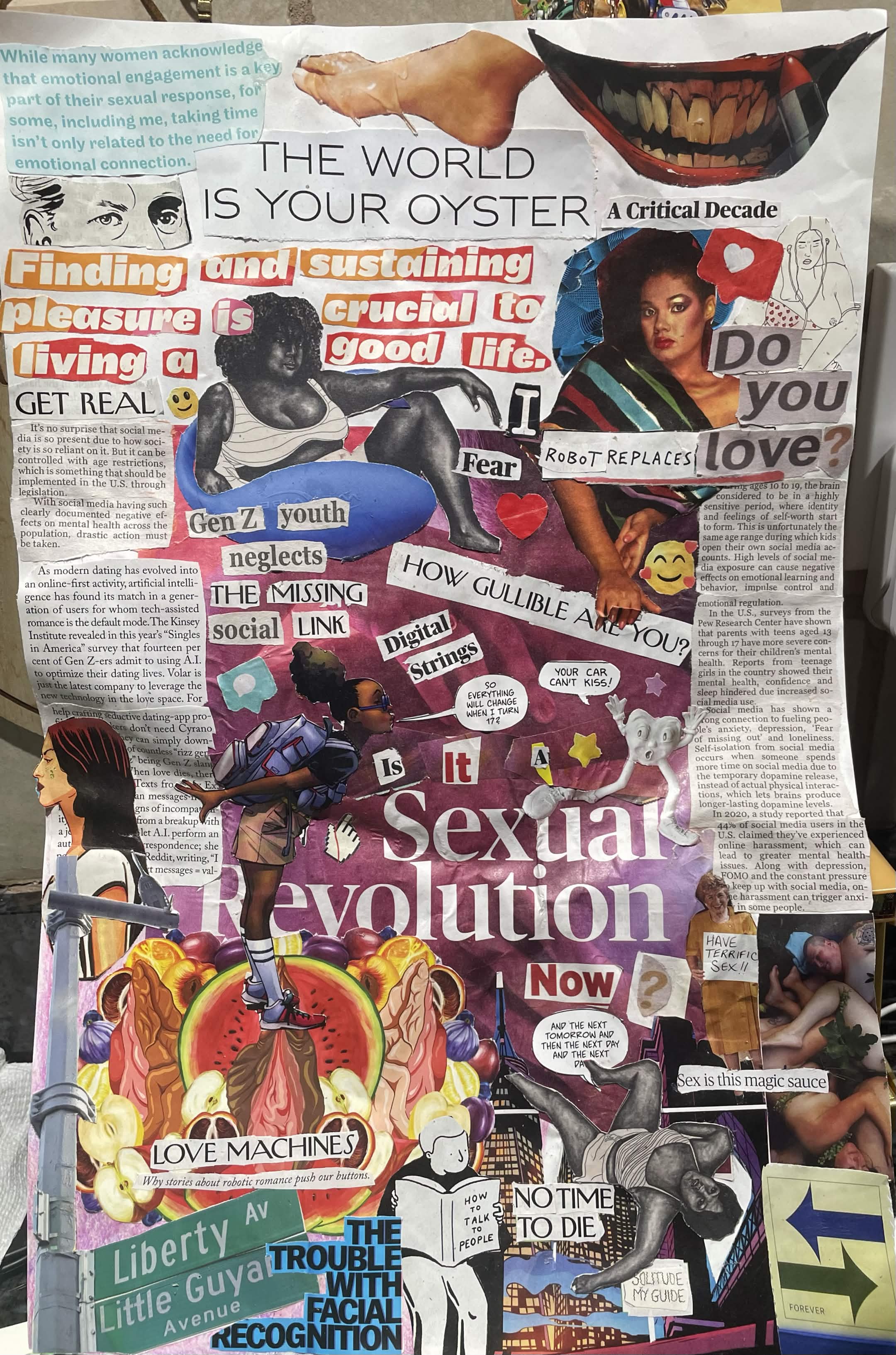
My collage (named “Is It a Sexual Revolution Now?” or just “Sexual Revolution”) is heavily inspired by Gen Z’s romantic and sexual expression and how it is being impacted by AI, causing us to lose touch with reality and struggle with maintaining human connection. I initially did not have an article to bring to class and was working purely with the materials provided the day of, so I am pretty proud of how the final collage ended up looking, since I was kind of just making up the composition as I went along and looked through the different magazines that day. I primarily used magazine images and articles with the occasional zine, comic and newspaper. I’m pretty passionate about this cause because I feel like with the rise of AI, a lot of the people in our generation are becoming more and more antisocial. I understand that COVID-19 has likely set a lot of us back developmentally, but I still feel like half of the people in this generation are seriously lacking in self sufficiency and still want to be coddled like teenagers, too afraid to pursue adult things; the other half wants to grow up too fast and are very ignorant, making the same mistakes as their parents and grandparents. Generally, I feel like both of these groups are immature at the core and I think AI is making it worse because now these people have an excuse to be ignorant and coddled and turn themselves away from human connection. AI is actively making us lose our critical thinking skills and the internet as a whole is warping both our perceptions of ourselves and what is fake vs reality.

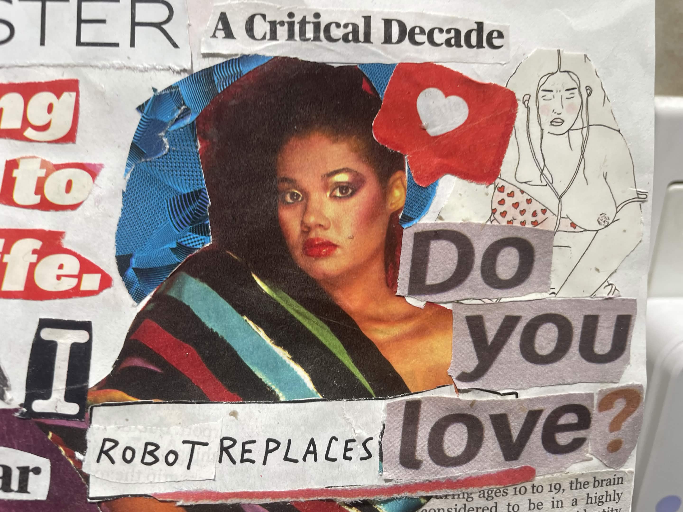
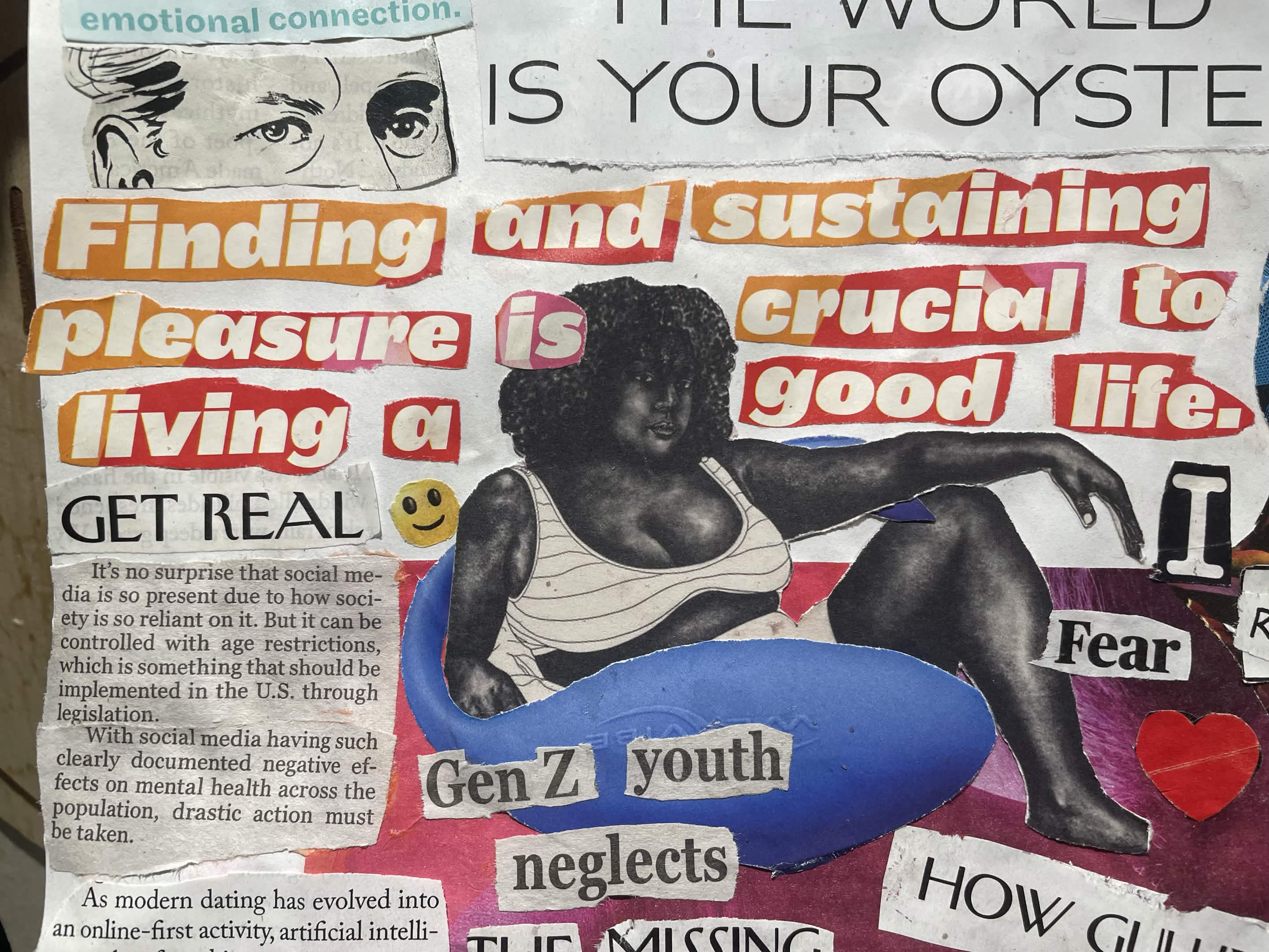
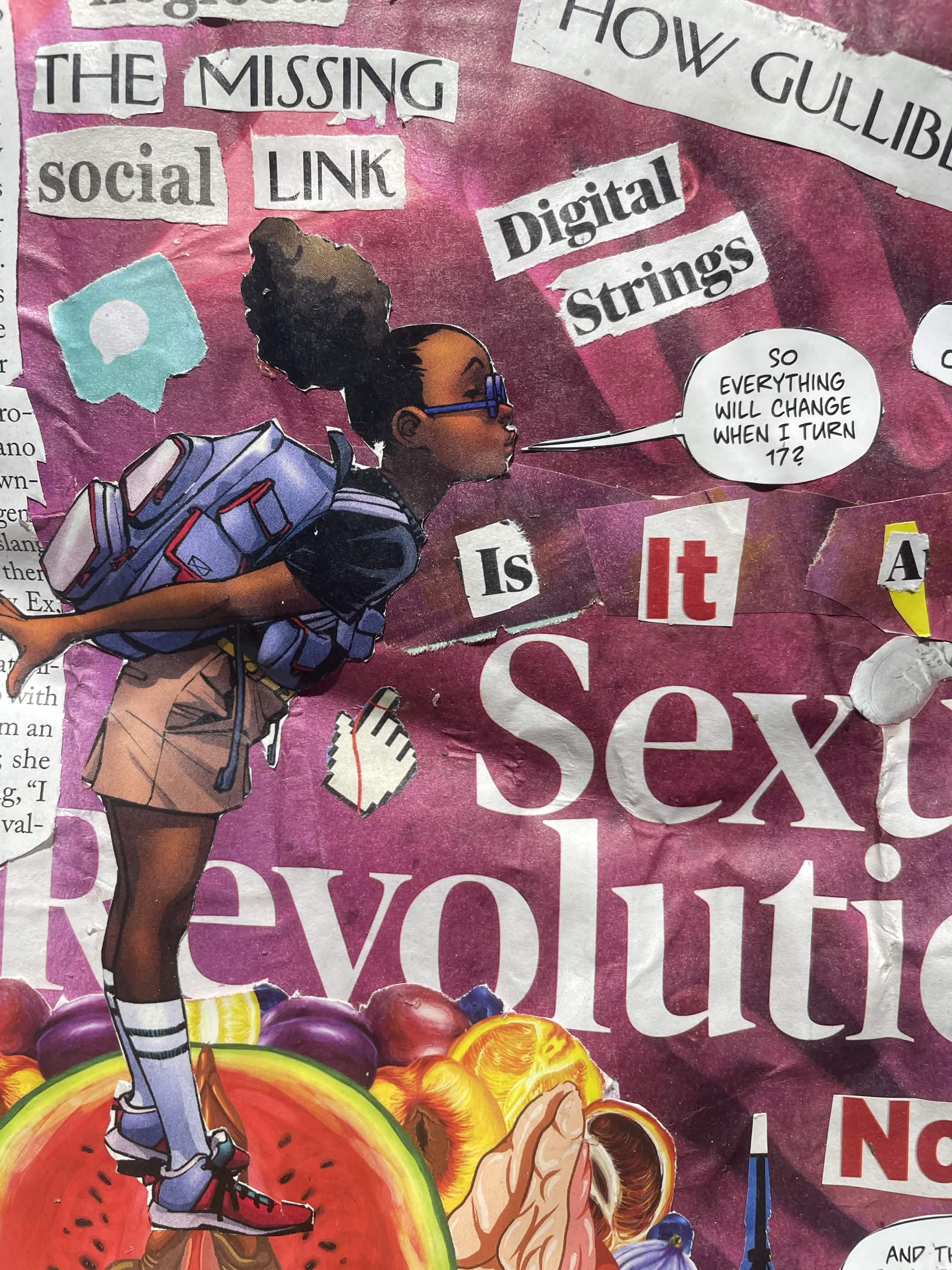
I’m happy with the final result but I really wish I had some more robot or technology imagery as I feel like it’s primarily human based, especially on human emotions like anxiety, love, and sexuality. I included some of my favorite details from the collage as well, such as the “Finding and Sustaining Pleasure” woman wrapped around a vibrator, the “crossword” sentences (Do you love?/Robot replaces love?), and the “17” girl. I’d love to go more into detail about all the intentional design choices for those interested, but I’ll leave it off here for now :]

rique collage

crossword section

pleasure section

seventeen section

Illan Grano

In my collage I chose to depict the recent changes to legislation surrounding small business in New York City. The new changes put in place by Mayor Mandani made it so small businesses didn’t have to do excess fillings and paper work. This made it so these businesses can prosper without the extra hassle. In my collage I have four main sections. The first is a large photo of Mandani, below him is a runner breaking through a red finish line. I chose to include this element due to the recurring phrase in my article “slash red tape for small business.” I also include this phrase in this section. In the next three sections I put together images of three of the sectors that benefited from this change in legislation, retail shops, child care, and foodservice. Additionally at the top i have the title for my article “open for small business.” The message I wanted to share to the audience was the importance small businesses have on New York City. To convey this message I used pictures with vibrant colors and smiling people. But the most important part is the runner crossing the finish line breaking the red tape to show how this is an accomplishment for the city. If I had more time and additional resources I would love to have depicted all the sectors that benefited from the legislation. Additionally, I would have added a few more key words or quotes from the article to make my message clear about what was actually done for small business. These additional quotes would solidify the meaning by giving clear evidence of how big this accomplishment was for both the city and small businesses. 

alt

Isabella Castillo – Protest Art

For this collage, I wanted to bring attention to pollution and how it affects people, animals, and the environment. The whole piece is built around one question: “Who Suffers?” because pollution is not just some far-off problem happening to “the planet.” It affects real living things that need clean air, clean water, and a healthy environment just to survive.

This topic is personal to me. I grew up visiting the Dominican Republic, and the beach has always been one of my favorite places in the world. However, there is a lot of pollution there, and I have noticed that there are not always strong protections for public land. Sometimes, people with more resources are able to buy land and turn it into private spaces for profit, while the environmental consequences remain for communities and the public to deal with. Growing up seeing these issues made environmental pollution feel real to me instead of something that only existed in articles or discussions.

I chose “Who Suffers?” as the title because I noticed that people often think about pollution as only a nature problem, only a human problem, or only an animal problem, rather than understanding how all three are connected. I wanted the question to encourage viewers to think beyond one group and consider the larger impact of pollution.

The article I read, “What Do You See?” from De Nichols’ Art of Protest, played a big role in shaping my design. It discusses how images can communicate ideas beyond what is immediately visible and how protest art encourages people to look deeper and question issues they may normally overlook. This idea influenced my approach because I did not want to show pollution only as an environmental issue; I wanted viewers to think about who is actually affected by it. That is why I included images of plastic waste, polluted water, air pollution, and animals. These images are meant to make people stop and ask themselves who truly suffers because of these problems.

I created the collage digitally using images from Wikimedia Commons. I also included a few small messages throughout the piece for viewers to discover if they look closely instead of placing everything directly on the surface.

If I had more time or materials, I would have preferred to create this collage by hand instead of digitally. I enjoy physical artwork, and I think a handmade version would have made the piece feel more personal and added textures that a digital collage cannot fully recreate.

Protest of art

Be the Voice: Gaza at Egypt’s Border – Mazen Mohamed

My collage supports Palestinians in Gaza, with focus on families stuck at the Rafah border with Egypt. I grew up in Alexandria, so the border between my country and Gaza is not an abstract line to me. The article I read covered the Columbia University pro-Palestine protests and the students who built banners overnight before their demonstrations. Layal, a Columbia student quoted in the piece, said their network and signage carried their message. I put her words at the center of my collage because she names the exact thing I was doing on the page, using visual language to speak for people getting silenced.

The images show three things. First, families trying to leave Gaza, including the boy in the hoodie running down what looks like an airport ramp. Second, the border itself, with the photo of a masked man standing between Egypt and Gaza. Third, an injured child, because the story does not end once someone crosses into safety. I added the Palestinian flag in the corner as an anchor and the “Help!” cutout because the word is small but loud on the page.

The cause matters to me because Egypt sits right next to what is happening, and my family talks about the border closings often. Watching people my age get shut out of safety while I sit in a classroom in New York feels wrong to ignore.

If I had different supplies, I would have added Arabic text next to the English words so the piece spoke to both audiences at once. Red paint or red thread across the “BE THE VOICE” letters would have pulled the eye toward the message faster. With more time, I would have layered the images more carefully and written a short paragraph in Arabic under Layal’s quote to tie the two languages together.

.