Blog Post 6 – Tucker Loth

When I first arrived at the American Folk Art Museum I learned that the current exhibition was titled Self-Made: A Century of Inventing Artists. This exhibit was meant to highlight artists that were outside of the traditional professional or academic art scene. This appreciation for self taught DIY art was similar to the ethos of the early punk music scene. Thus, I believe that every work associated with this exhibit was inherently some degree of punk. Some pieces required more raw talent whereas others looked more rudimentary. When thinking of how members of the punk scene often had discourse of what it means to be punk, I thought about how they would likely argue that some works were too polished or perfect. 

Joe Coleman's vest titled "Sunday Go to Meetin'"

For my first piece I selected Joe Coleman’s “Sunday Go to Meetin”. Initially upon viewing this vest covered in pins, pendants, and personal memorabilia I thought that this looked reminiscent of the expressionist clothing frequently worn by many members of the punk scene. Upon further investigation of the objects adorning the vest you will notice that there are some pretty absurd items. Some examples include the artist’s taxidermied cat paw, locks of his wife’s hair, a devil, a pin of Lenin, and two guillotines. These items closely align with punk iconography so I think it would be fair to assume that Joe himself was a punk. It is worth noting that this vest was never meant to be worn out but rather to be a collection of memorabilia. Considering the question of whether or not it was intended to come across as punk I say no, for the simple reason that I don’t think it was “meant” to come across as anything. This piece is more akin to a photo album depicting one’s life, and in the case of Joe Coleman his life happened to be punk. 

Eddie Owens Martin untitled drawingEddie Owens Martin untitled drawing

For my second piece I chose two untitled drawings from Eddie Owens Martin, also known as St. Eom. These two pieces depict Eddie Owens in many different physical forms and outfits, painting the picture of an individual exploring their own identity. The level of exploration ranges from simple changes in clothing, all the way to futuristic surreal representations of themselves. When reading the placard you learn that Owens fled their home in Georgia at just 14, moving to New York City where they worked as a fortune teller, drag queen, and sex worker all while exploring the art and culture offered by the city. Owens rebelled against their upbringing, explored and expressed their identity, and worked in taboo industries, all while enjoying the arts. Therefore, I find this individual and their art to be incredibly synonymous with the punk movement. I don’t believe that they intended to come across as punk, in part because “punk” didn’t exist yet, but rather they simply expressed themselves to the fullest, which is inherently very punk.

Blog Post 5 – Tucker Loth

Photo of Patricia Ayres Sculpture on the Highline

For my blog post I decided to use Patricia Ayres collection of sculptures titled “2-18-5-14-4-1-14-3-12-15-14-6-5-18-20”, “7-5-18-20-18-21-4-5-8-5-9-6-20-1”, and “2-15-14-1-16-9-14-1.” To answer the prompt quite simply, no, it cannot be replicated in the way that paintings can. When I first approached this somewhat unsettling sculpture of bulging elastics, hooks, and straps it somehow immediately felt organic or human. I had not read the placard yet much of the artists intention was conveyed to me. These pieces were meant to look like “anthropomorphic sculptures that blur the boundary between body and garment.” I feel that by being immersed in nature I was already primed to look at this piece with an organic natural lens. While looking back at the photographs I took, being removed from the intended setting, that message does not feel easily conveyed. If the High Line offered a print or a miniature replica of this piece in their gift shop, I would have the same assessment that I had when I viewing Water Lilies by Monet at the MOMA. That is, if you are not witnessing the art in its intended setting, or at its intended scale, then the impact will likely be lost on you. Furthermore, if this exhibit was moved to an indoor setting I believe that much of the organic feelings brought on by its blending with nature would be lost.

Blog Post 4 – Tucker

This week in class we had a lecture from the two founders of Queer Van Kult. Above all else I found myself surprised by how grass roots this art collective is. When I think about running an art gallery in the city I picture millionaires and billionaires renting gallery space in Chelsea as a fun side project. However, Zoë and Nicie prove that with enough dedication anyone can do it. It was really interesting to be able to learn how they are able to come up with funding to organize these events. I had never heard of the NYC art council and after learning that they are a source of many art grants, I found them to be an amazing program. One question that I, and a few others, had was how being based in Staten Island has impacted their collective. When I think of Staten Island I picture a conservative enclave of the city that may not be receptive to a LGBTQ+ organization so I was interested in their experiences. What I heard from Zoë and Nicie is that, for the most part, there have not been too many issues (outside of one controversy where a person complained that their art work is demonic, even going as far as to make up the use of pig’s blood). Fortunately, the vast majority of people are only supportive and they are able to pull big crowds to their events. I think Queer Van Kult is an amazing organization that helps make art more accessible while also serving as a space for LGBTQ+ people in a region that would otherwise be lacking. In the city, I find that the art scene has become too commodified so it is very refreshing that collectives like this still exist. 

Blog Post 3 – Tucker Loth

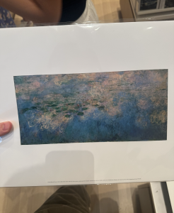
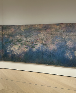
Monet's Water Lilies Print Monet's Water Lilies Painting


For my artwork I chose Claude Monet’s Water Lilies 1914-26. Rather than first finding a piece of artwork on display, I started this assignment by looking at what works were being recreated in the gift shop. They had many pieces to choose from but, being a fan of his work, I was drawn to the Monet prints. I selected the piece Water Lilies 1914-26 and found it to be quite similar to many of the other works done by Monet. That is, a serene painting of nature in an impressionist style. With my photo captured I moved on to find the original work and WOW! When I walked in the room I immediately realized that the print I selected did very little to capture what was so awesome about the original work. The print was actually just a photo of one out of three massive paintings that take up an entire wall. Monet’s intention with this work was to give a panoramic view that immerses the viewer in an impressionist depiction of his lily pond. When you are viewing this work on a small print, it loses its grandeur. It goes from feeling like you’re watching a concert live to feeling like you’re listening to a concert on your iPhone speakers. I think that the print is a nice souvenir to remember the original work but it does very little to capture the actual meaning of the painting.

Blog Post 2 – Tucker Loth

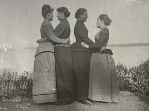
Alice Austen Photo of women holding eachother

In the most simplistic of terms, the photo I chose to share shows my group having fun. Alice Austen had two distinct styles of expression with her photography. One side was that of the documentarian, in which she showcased everyday life with photos of people and communities on the street. The other was an expressionist window into her personal life. The ladder example is closer to what my group attempted to recreate. In Austen’s original photograph she set up a shot of her and her three friends hugging each other in a somewhat intimate way. When I saw this photo it struck me by how contemporary it felt. The photo closely resembled a group photo that I would take with my friends during a night out. This personal resonance was the reason I selected it for my photo reenactment. In my group we attempted to have the same framing as the original photograph, the major difference is that we attempted to make a heart shape with all three of our arms (I ended up botching the heart shape because I didn’t put my elbows together </3 ). We did this in part because we were just having fun, but also because we wanted to recreate Austen’s free spirited style. Our reenactment illustrates community because it shows how human relationships are, in the most basic form, about spending time with one another.

Blog Post 1 – Tucker Loth

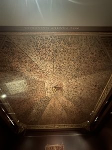
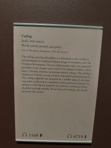
For my visit to the Met I chose two pieces of artwork that spoke to me. First, an ornamental ceiling with no other title than “Ceiling” given on the placard. I recalled in our first class meeting, when discussing “The Creation of Adam” in the Sistine Chapel, that humans tend to have a feeling of awe when looking up. This fact was confirmed to me by the amount of time I spent observing the complexities and subtle details in this ceiling. After walking away and massaging my sore neck I considered one of the questions for the blog post: does this support my idea of art? For this piece my answer was an easy “yes, of course!” The level of human talent and creativity that goes into creating a piece like this, and the fact that it was designed to be viewed by many all contribute to my assessment that this is clearly a piece of art. When considering how this piece relates to the city I deferred to the placard for context. Apparently this piece is from a Christian church in Spain however the design is clearly Islamic. The story is that during Christian conquests against Muslim rule a new art style known as mudéjar was born, in which many christian churches blended their artistic styles with Islamic influences. This blending of cultures, although somewhat violent in this context, reminds me of how art and style in NYC has blended with many different cultures around the world.

A ornamental ceiling in the mudéjar style

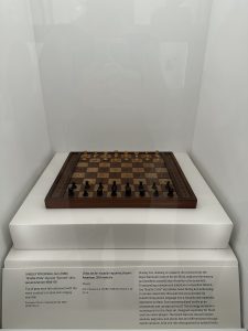
For my next piece I chose a chess board that was on display in the new costume exhibit. This piece was meant to be an addition to a costume that displayed the word “untitled” written in braille; however, I found this chessboard more interesting. It featured raised squares and tactile playing pieces in order to facilitate the game of chess for blind and low vision players. When asking the question of whether or not this is art the answer becomes more difficult. This piece displays a nice craftsmanship and thoughtful design although it was likely mass produced for a utilitarian purpose. Does that objectively disqualify this as art? I’m honestly not sure, but I do find beauty in its purpose and design, so to me, I would consider it art. When relating this piece to NYC I think about the people playing chess in parks and how a board like this could increases the accessibility to many others. Its inclusion of disabled players reminds me of the ethos of acceptance shared by many New Yorkers.

A chess board designed for the visually impaired